
Developing Social Skills Together
Industry: Social Services
Role: Founder & Sole Graphic Designer
Timeline: 2015 - 2017
Deliverables:
• Brand Strategy & Positioning
• Non-Profit Group Management
• Program Development & Facilitation
• Community Program Design
• Visual Identity
• Print & Digital Marketing Materials
• Social Media Strategy & Management
Am Grünen Bäumchen was a nonprofit peer support group for adults with social anxiety and social phobia. Founded in 2015 in Leipzig, it operated in partnership with the Community and Counseling Center Grünau.
The initiative provided a safe and non-judgmental environment where members could share experiences, practice social skills, and build supportive connections.


Reaching the Unreachable
The hardest part wasn’t spreading the word. It was asking people who feared connection to take a chance on it. Through steady effort, clear intention, and shared vulnerability, a small weekly group became proof that comfort can grow from consistency.
Reaching those reluctant to be reached required empathy above all. I saw how traditional programs missed younger adults who felt invisible in large, formal settings. With support from the local Counseling Center, I created a small, welcoming group that met weekly.
Careful outreach, gentle design choices, and my own openness helped others risk connection. Over time, showing up became easier for them and for me.
In a city full of services with long queues and closed doors, accessibility became the goal. Am Grünen Bäumchen was built for a generation used to quiet messages and cautious steps, creating a space that replaced hesitation with ease.
Defining the Audience
Local research revealed an overlooked group: young adults left out of existing mental health support in Leipzig. Many never reached out because making a phone call felt too daunting. To change that, Am Grünen Bäumchen positioned itself as a modern, approachable alternative.
A calm visual identity, clear digital presence, and simple online contact turned the first steps into something manageable, welcoming those who had felt unseen.
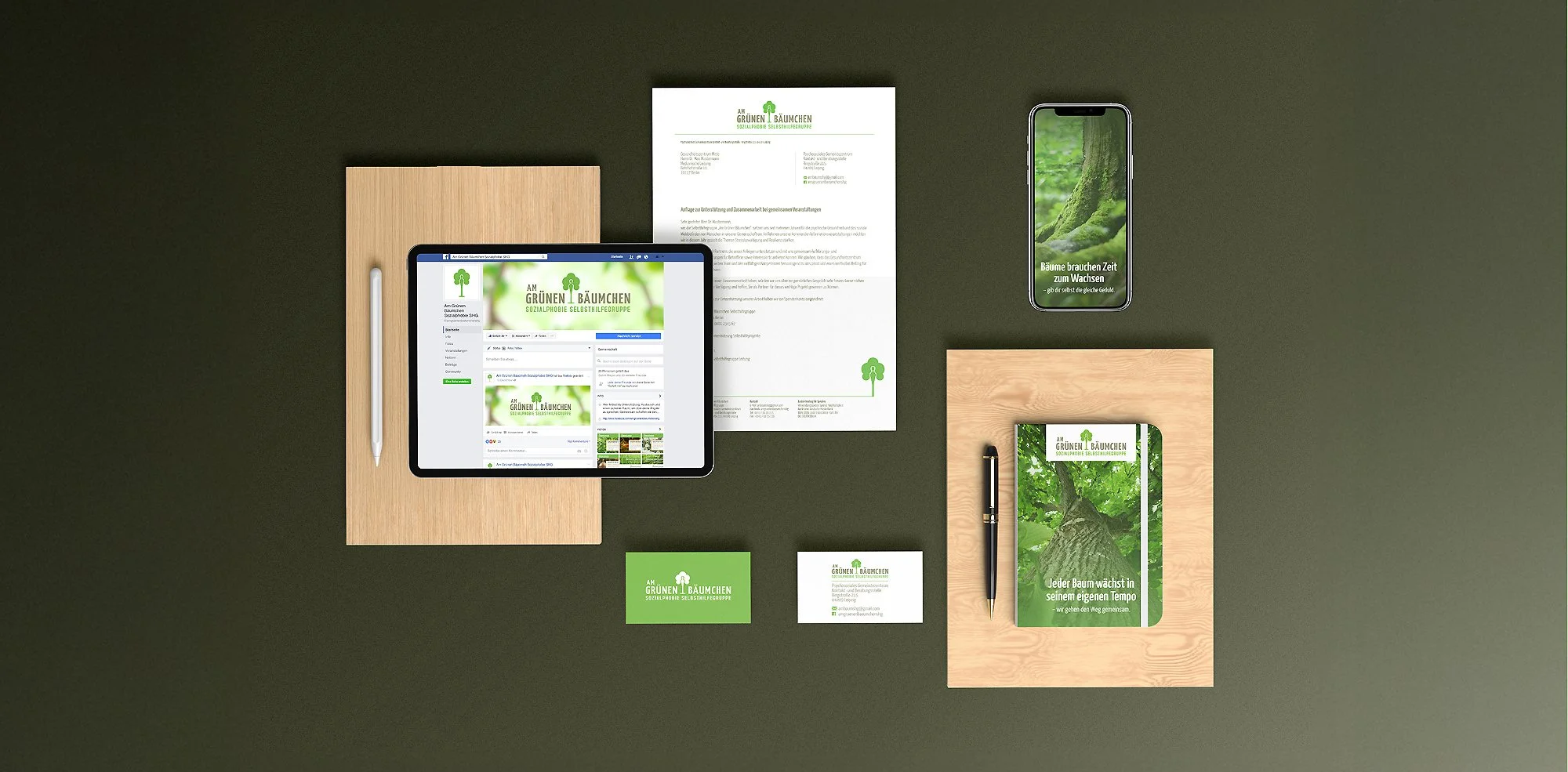
The name Am Grünen Bäumchen carried the story on its own. Drawn from the community’s affectionate nickname for the center, it spoke of growth rooted in care. The identity built around it became a quiet reminder that healing, like a sapling, needs light, time, and belonging.
Design Highlights
The identity for Am Grünen Bäumchen grew naturally from its name, a community term that already carried warmth and meaning. The logo blends human and tree forms to convey growth supported by connection.
Calming greens echo stability while a touch of marigold brings optimism. Paired with friendly type and clear icons, the result feels modern yet gentle —
a design that invites trust without needing to announce it.


Success wasn’t measured in numbers but in the quiet consistency of people who kept coming back. Week after week, the same faces gathered. Not because they had to, but because they’d found a space that felt safe, steady, and real.
Project Impact
This project’s success lived in the people who returned. A core group of 10–15 members built a rhythm of trust, strengthened by genuine connection and steady care. Facebook messages and quiet growth reflected how accessible the space had become.
Feedback spoke of being seen, heard, and understood— proof that the design’s warmth and professionalism had created real belonging. In that reliability, a true community took root.


Growth rarely happens in isolation. This work reminded me that stepping into discomfort is part of making space for others. The group’s strength after I left was proof that the foundation of empathy and good design can stand on its own.
What Stayed With Me
This project taught me that meaningful design begins with empathy. To help others open up, I had to do the same. Leaving in 2017 was difficult, yet seeing the group continue proved its real strength lay in community, not leadership.
It also showed me how design can connect people in lasting ways. What started as a local initiative became personal growth. A reminder that care, expressed through design, can echo far beyond its start.
This also might be interesting
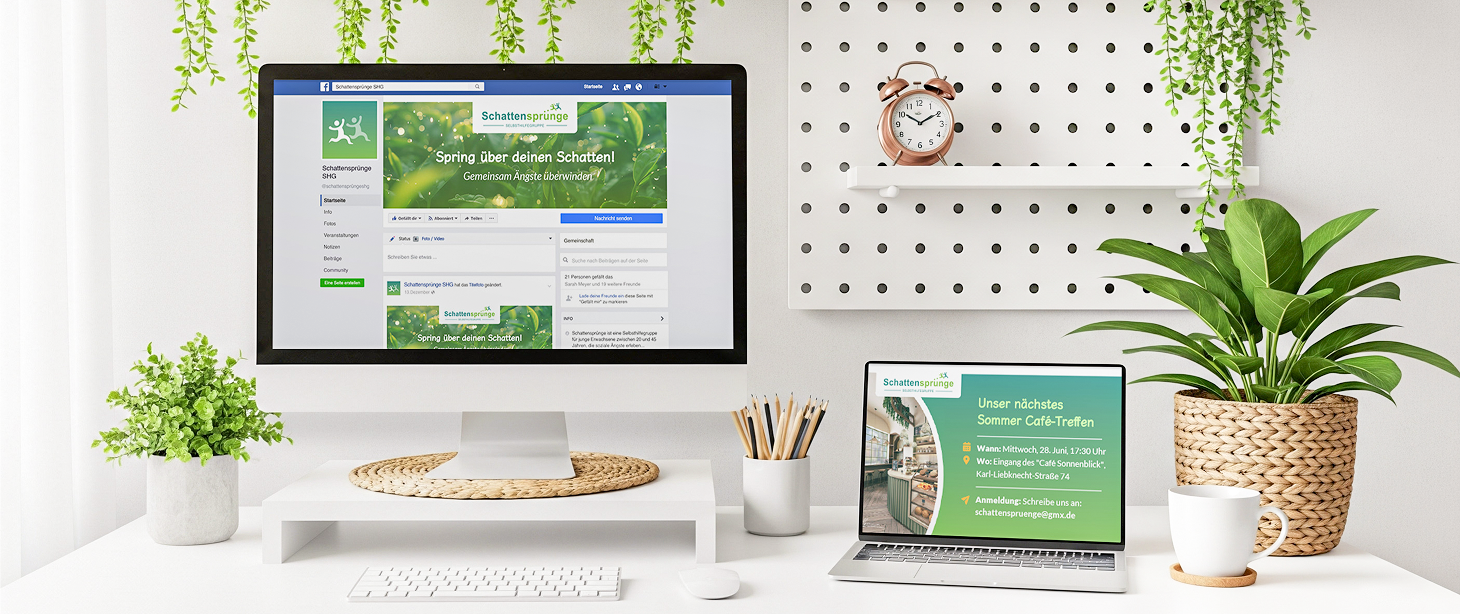
Schattensprünge
Schattensprünge is a non-profit support group for young adults experiencing social anxiety.

Eindruck
Eindruck highlights overlooked projects through curated editorials and thoughtful features.

IMIB-Network
Service design to help international professionals find startup support in Finland.
