
Designing for Women’s Healthcare Needs
Industry: Healthcare
Role: Sole Graphic Designer
Timeline: May - June / 2025
Deliverables:
• Brand Strategy & Positioning
• Visual Identity
• Research & Insights
• User Experience & Service Design
• Marketing Materials
• Service Design Elements
HoivaHelmi is a free support service concept created to empower immigrant women navigating Finland’s healthcare system.
Inspired by real challenges like language barriers, cultural differences, and lack of information, the project highlights how thoughtful branding and service design can improve access, build confidence, and promote equality in healthcare.


Building Trust Through Accessible Design
The hardest part wasn’t the design itself—it was finding the right way to communicate care. Balancing data with warmth, professionalism with softness, became both a creative and personal test.
Researching Finnish healthcare data and shaping it into something visual and inclusive was the project’s greatest challenge. I wanted to balance professionalism with care, ensuring immigrant women could see themselves reflected in the design. My own health experiences made this work deeply personal.
By transforming complex information into accessible visuals and clear language, I created an identity that feels both trustworthy and warm—using design as a quiet tool for empowerment and empathy.

Data showed the challenge, but empathy shaped the response. HoivaHelmi bridges the space between available services and real understanding, offering navigation and guidance where many feel most unseen.
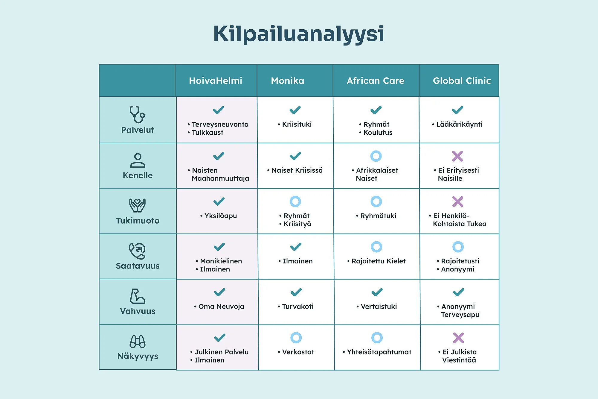
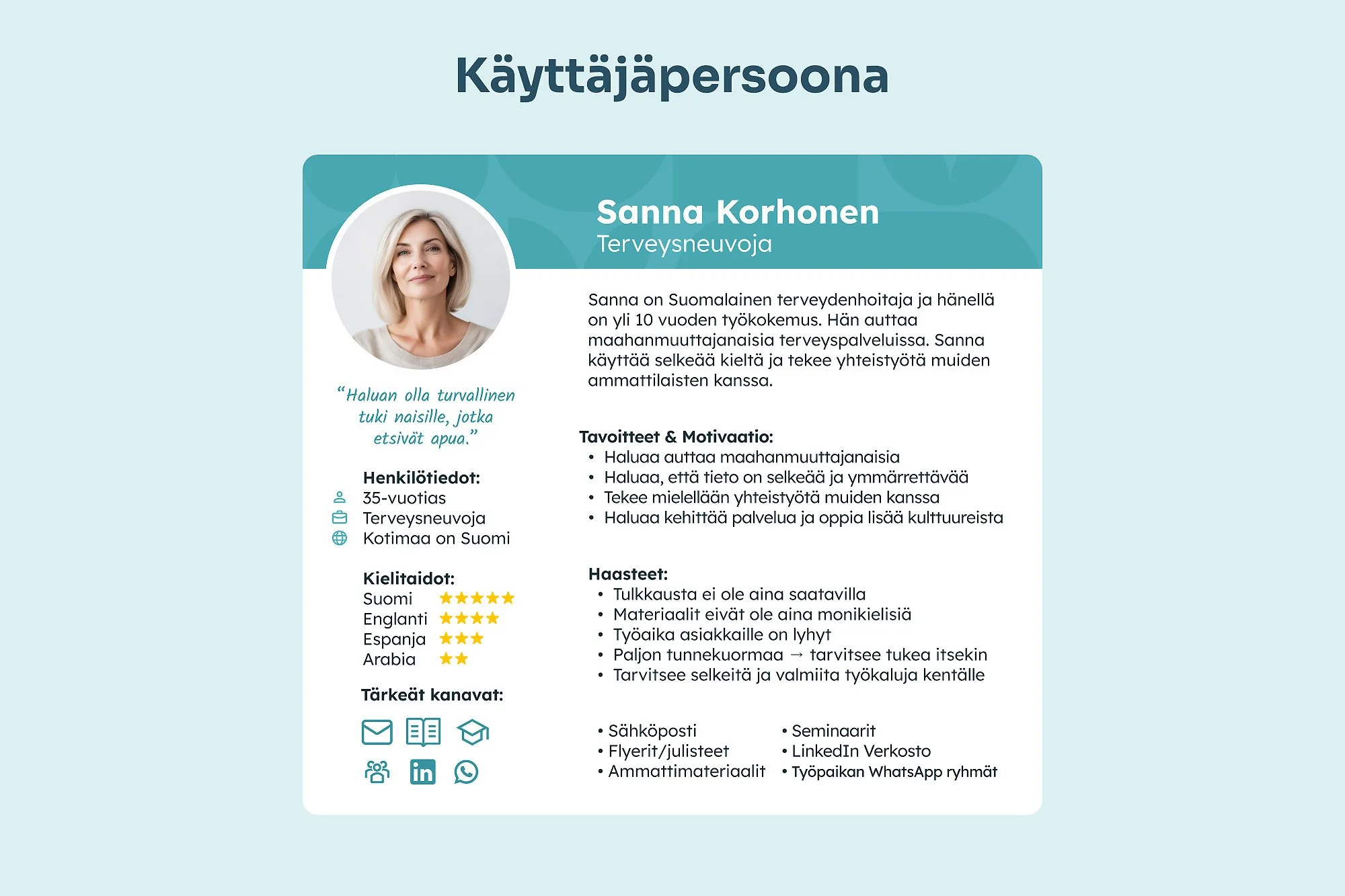
Defining the Audience
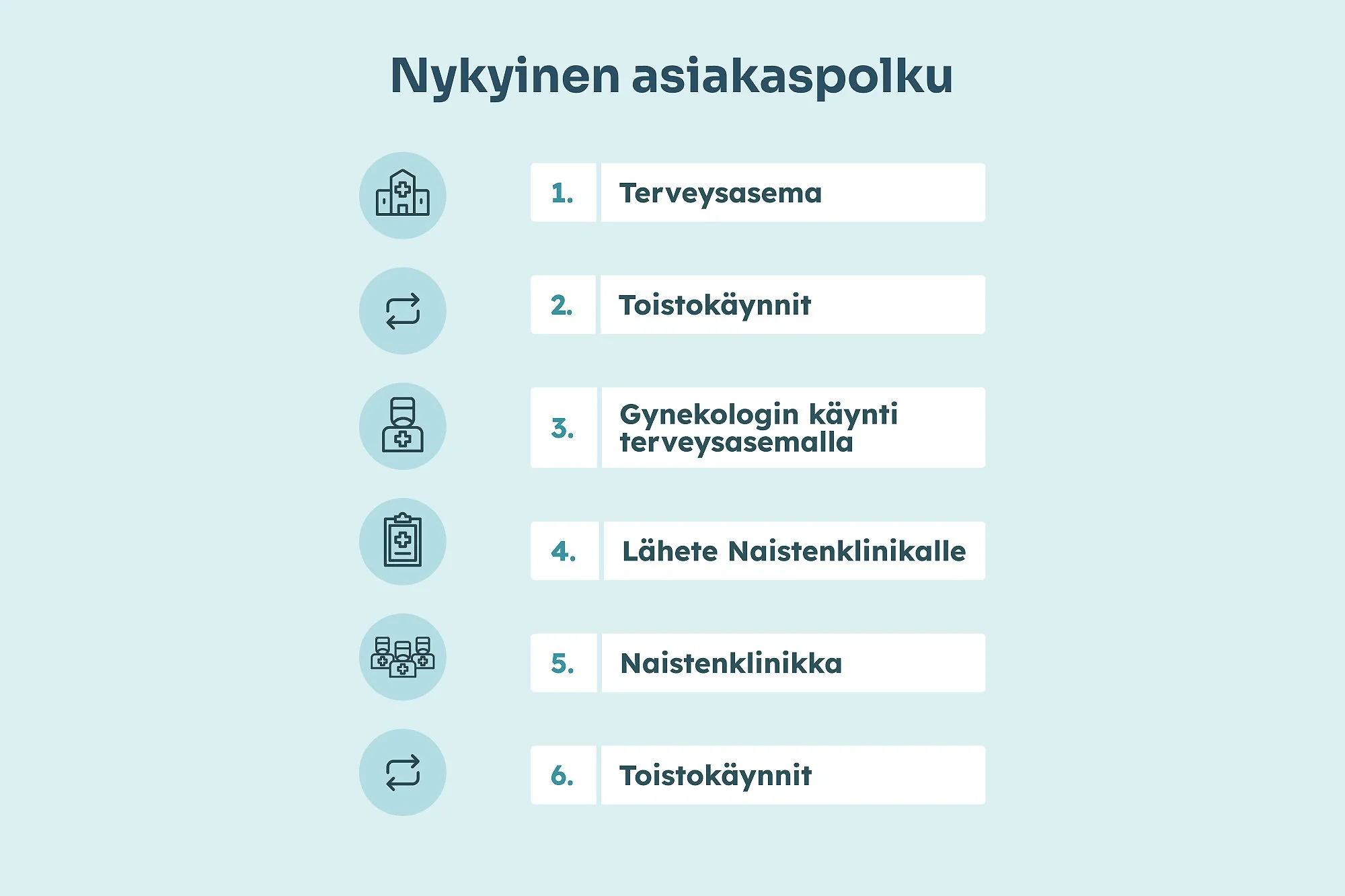
Research showed clear gaps in Finnish healthcare accessibility for immigrant women. Beyond language barriers, many face long waits, poor communication, and feelings of dismissal. HoivaHelmi responds to these realities with an inclusive approach that blends practical support and empathy.
While existing organizations provide help, nationwide access and personal guidance remain limited. Through accessible communication and thoughtful design, HoivaHelmi offers a more connected and human way to navigate healthcare.


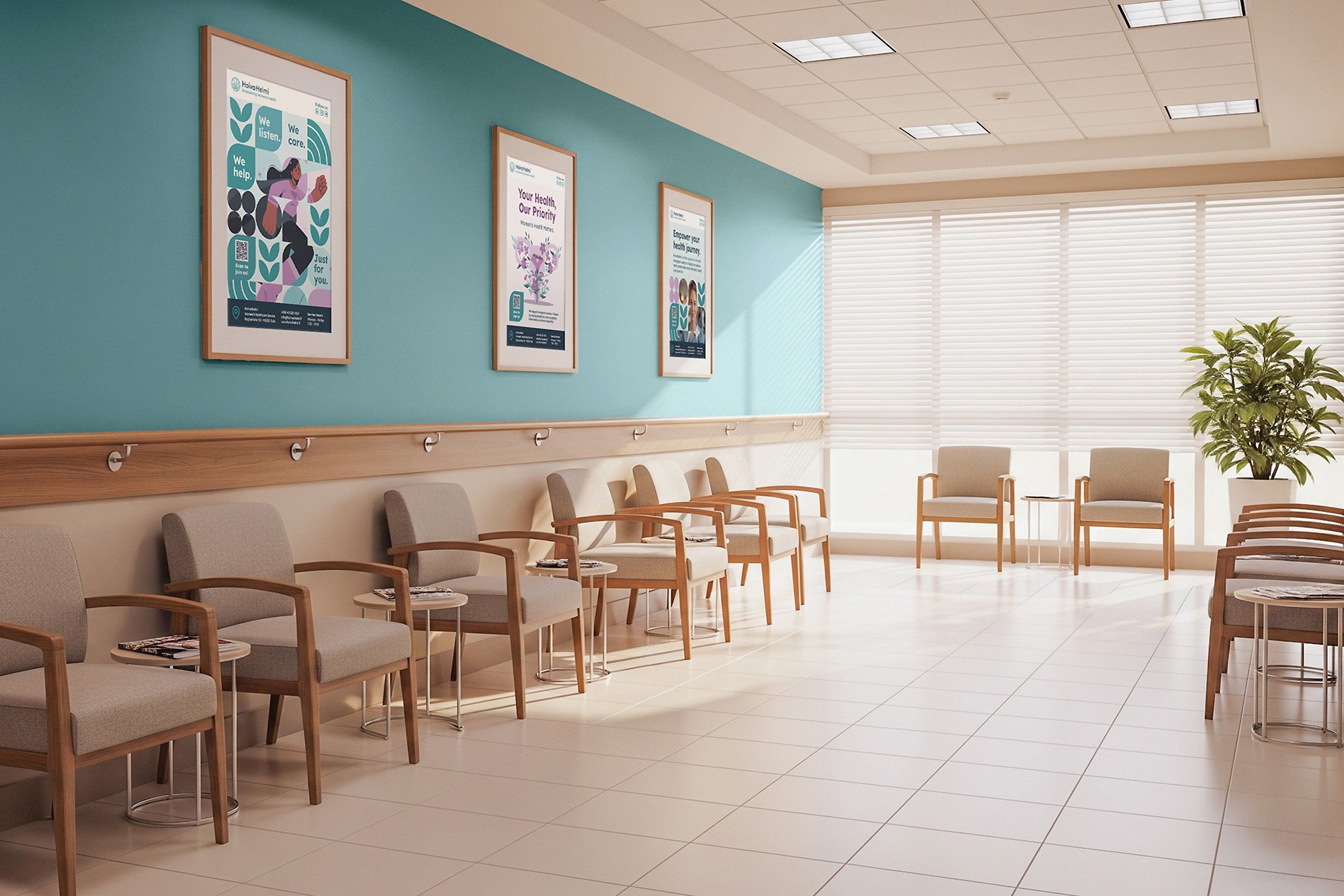
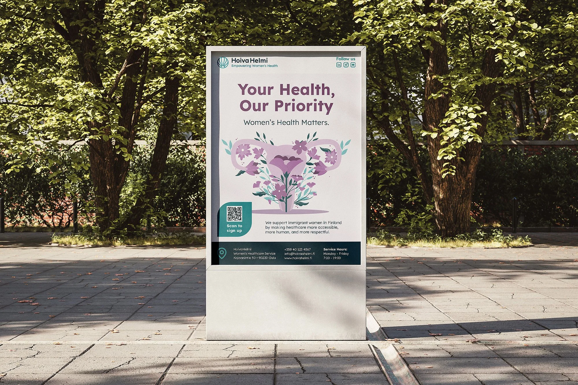
The design of HoivaHelmi aims to make healthcare feel less clinical and more compassionate. Thoughtful color, legible type, and gentle geometry turn complex information into something truly approachable.
Design Highlights
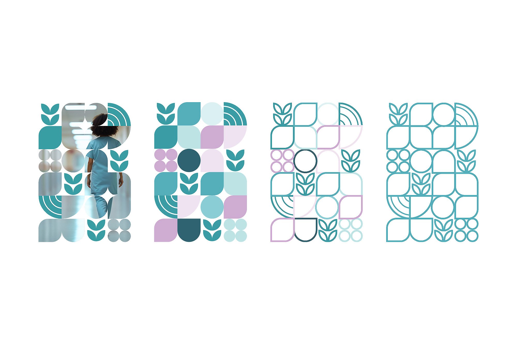
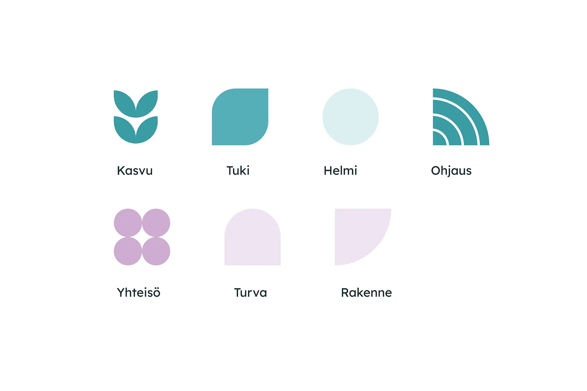
HoivaHelmi’s design strategy balances warmth and professionalism to create a sense of safety and inclusion. A calm palette of turquoise and lilac builds trust, while clear typography ensures understanding across languages.
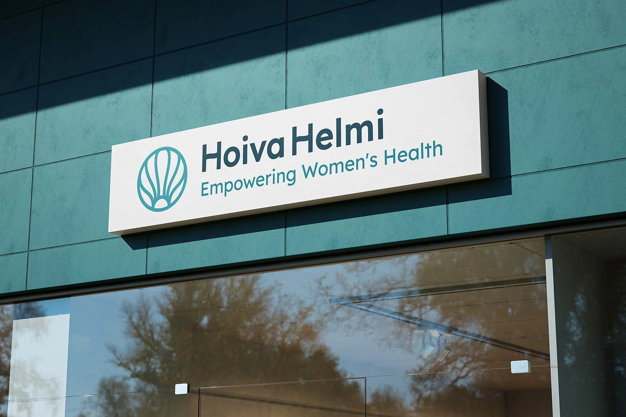
The seashell logo and geometric patterns reflect unity and care, transforming healthcare communication into something gentle and accessible. Through visual clarity and empathy, HoivaHelmi shows how design can make support feel personal and kind.


What started as a conceptual project became a reflection on how design can quietly solve real problems, building reassurance for those who need it most.
Project Impact
Though HoivaHelmi is a conceptual project, its purpose lies in making healthcare clearer and more approachable. The process strengthened my design skills across presentation tools and deepened my understanding of accessibility and color contrast.
Exploring geometric patterns helped refine a distinct and cohesive identity. More than a visual exercise, it became proof that thoughtful design can address real challenges and support communities that deserve to be seen.


What interested me most in HoivaHelmi wasn’t the design system itself, but what it stood for. It tested how far visual choices can go in shaping comfort, understanding, and safety for those often overlooked in healthcare.
What Stayed With Me
HoivaHelmi is a conceptual project shaped around empathy and equity in healthcare. Its identity focuses on making care feel approachable, trustworthy, and inclusive for immigrant women.
Through this work, I deepened my understanding of accessibility, color contrast, and visual storytelling. More than a design exercise, it became a study in how design can build connection and foster belonging.
This also might be interesting
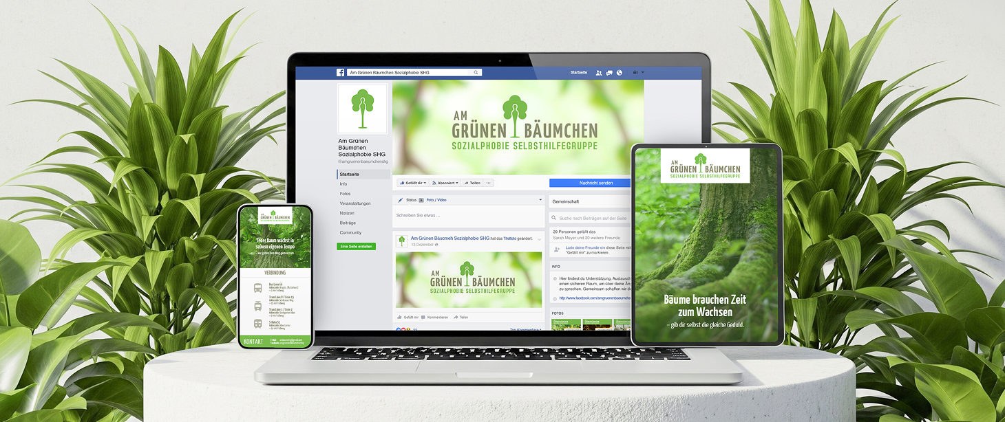
Am Grünen Bäumchen
Gentle identity for a mental health support group to built trust and understanding.

Eindruck
Eindruck highlights overlooked projects through curated editorials and thoughtful features.

IMIB-Network
Service design to help international professionals find startup support in Finland.
