Creating Clearer Pathways to Entrepreneurship
Industry: Education
Role: Service Designer
Team:
• Lan Anh Tranová
• Maria Sabashvili
• Valeriia Sirik
Timeline: 6 weeks / 2025
Deliverables:
• Research & Analysis
• Ideation
• Wireframing & Prototyping
• Testing & Validation
During a six-week service design course with the CeMeWE project at Laurea University, I refined my skills by designing for real social impact.
Our team collaborated with the EU-funded IMIB-Network, which supports immigrants seeking employment in Finland, focusing on improving its Entrepreneurship Path. Through user research and service mapping, we identified points where participants often lost motivation or clarity.
I helped design a landing page and flyer that simplified information, emphasized inclusivity, and guided users through the next steps with confidence. The experience reinforced how thoughtful design can turn empathy and research into practical tools that empower people to take action.
Designing for Follow-Through
The Entrepreneurship Path was full of potential, yet most people never made it through the door. More than thirty signed up, but only a few arrived. Our work focused on understanding that gap. Why interest faded and how design could help turn curiosity into commitment.
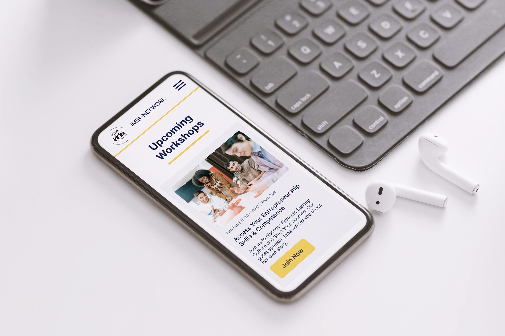
The Entrepreneurship Path faced a clear gap: strong sign-ups but low attendance. Our team examined where motivation was lost and redesigned the process to rebuild trust and commitment. We created a central landing page, simplified sign-up form, and planned automated follow-ups to sustain interest.
Together, these elements formed a smoother, more transparent journey that helped turn intention into action and gave the program’s participants a clearer path forward.
The audience was clear but underserved: migrant professionals and students trying to build secure futures. What they found instead was a confusing path and missing reassurance. Our goal became creating clarity that felt both reliable and human.
Defining the Audience
Our research highlighted educated migrants in Finland (mainly women aged 24–40) seeking stability through entrepreneurship. Despite their motivation, the existing program left them frustrated by scattered information and impersonal communication.
We addressed this by redesigning the journey into a cohesive, transparent experience. By streamlining access, sharing success stories, and clarifying next steps, we rebuilt trust and made participation feel structured, supportive, and worthwhile.
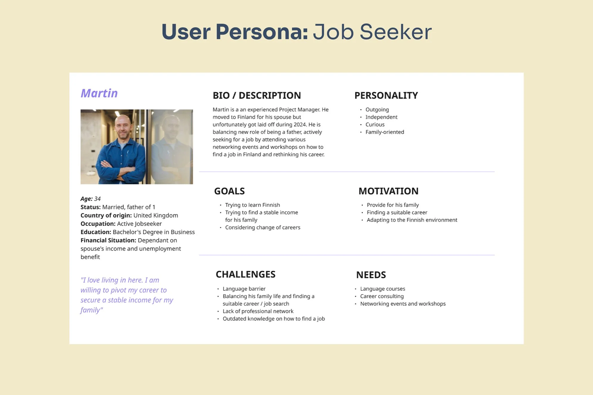
A UK project manager and new dad seeking career guidance to overcome language barriers and secure family income in Finland.
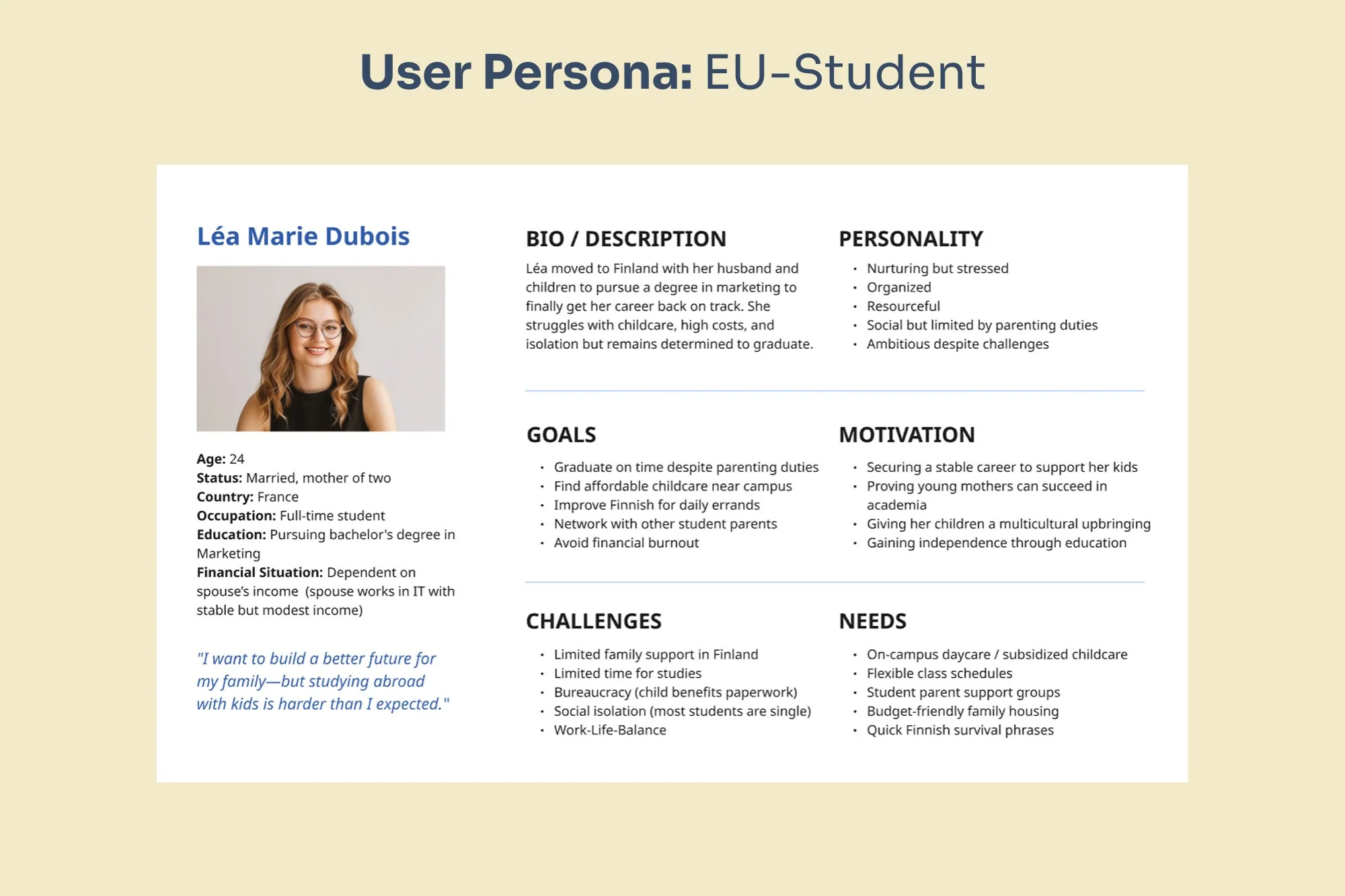
A French marketing student and young mother seeking childcare solutions and peer support to balance studies and family life.
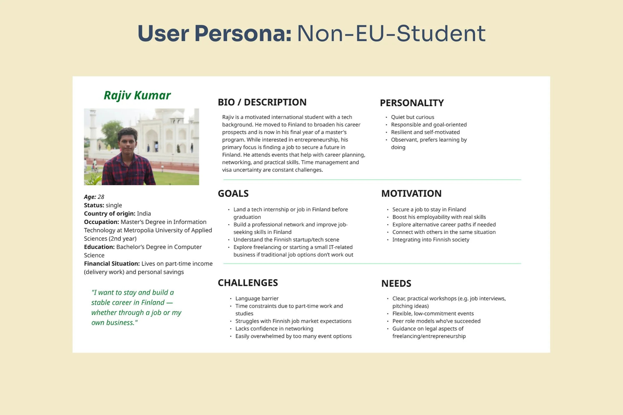
An Indian IT student focused on securing a Finnish job, needing practical guidance on local job markets and visa processes.
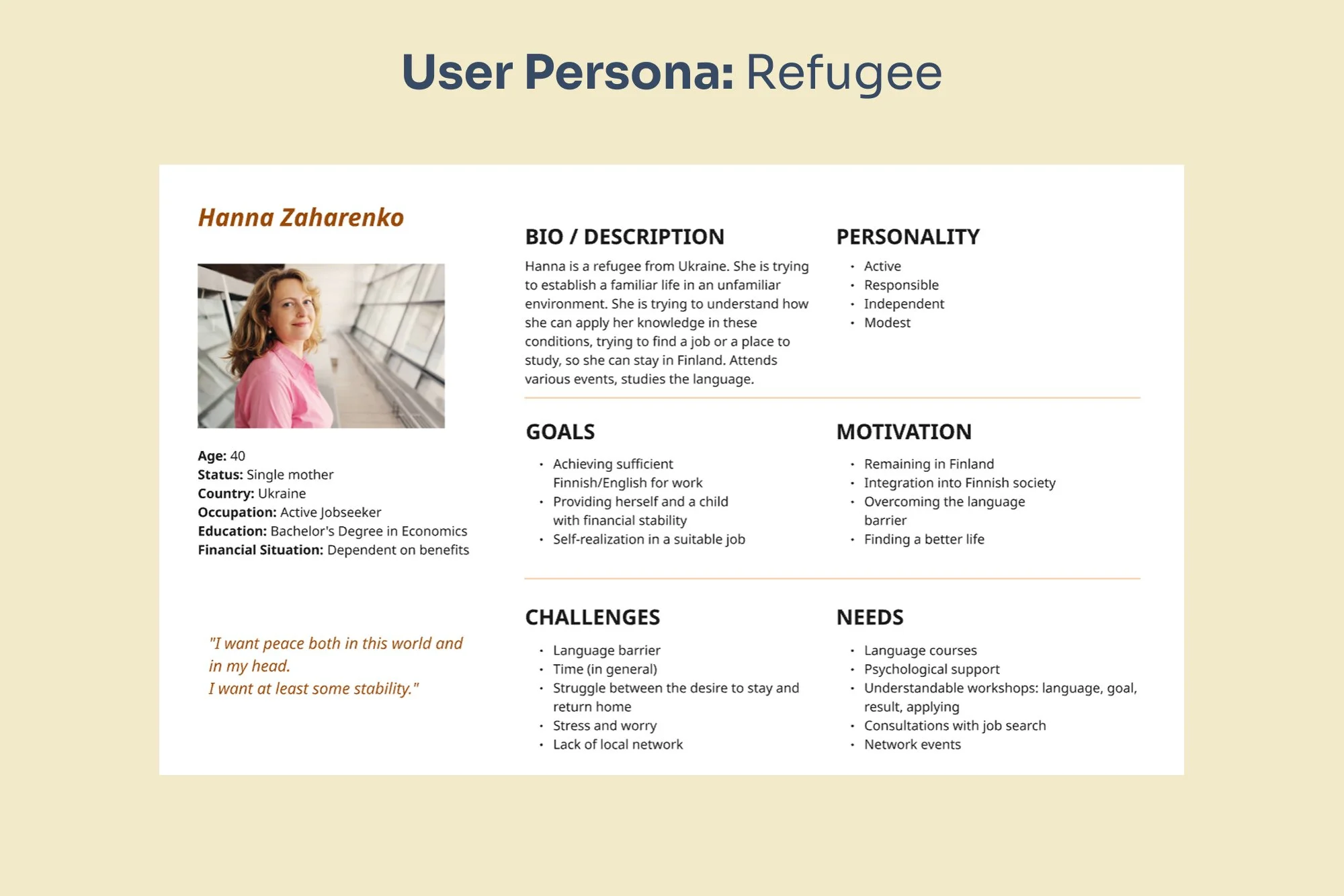
A Ukrainian single mother and economics graduate pursuing language skills and stable employment to build a new life in Finland.
A Pathway That Feels Possible
The work began with listening. By creating user personas and tracing their real experiences, we learned how small frustrations added up to lost motivation. From there, every idea we developed aimed to make engagement simple and reliable.
Our team used a structured, human-centered process to understand why participants lost interest after signing up. We created four user personas and mapped their journeys, revealing shared obstacles and unmet expectations.
Collaborative workshops helped us prioritize ideas and co-design solutions that addressed these gaps. By visualizing the full participant journey, from first contact to follow-up, we ensured our final plan worked smoothly for users and the organization alike.
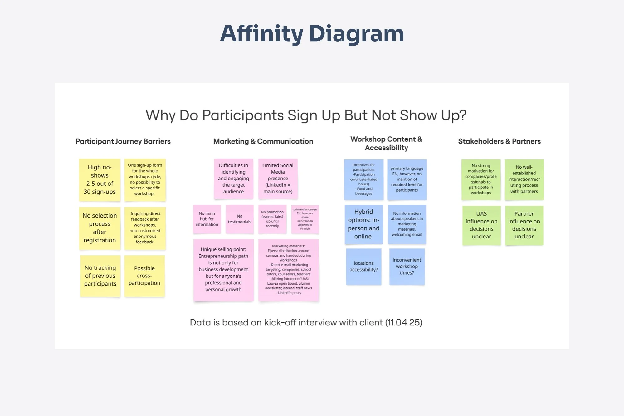
The Affinity Diagram helps identify key barriers, such as fragmented sign-up, weak outreach, and unclear value, that led to low attendance.
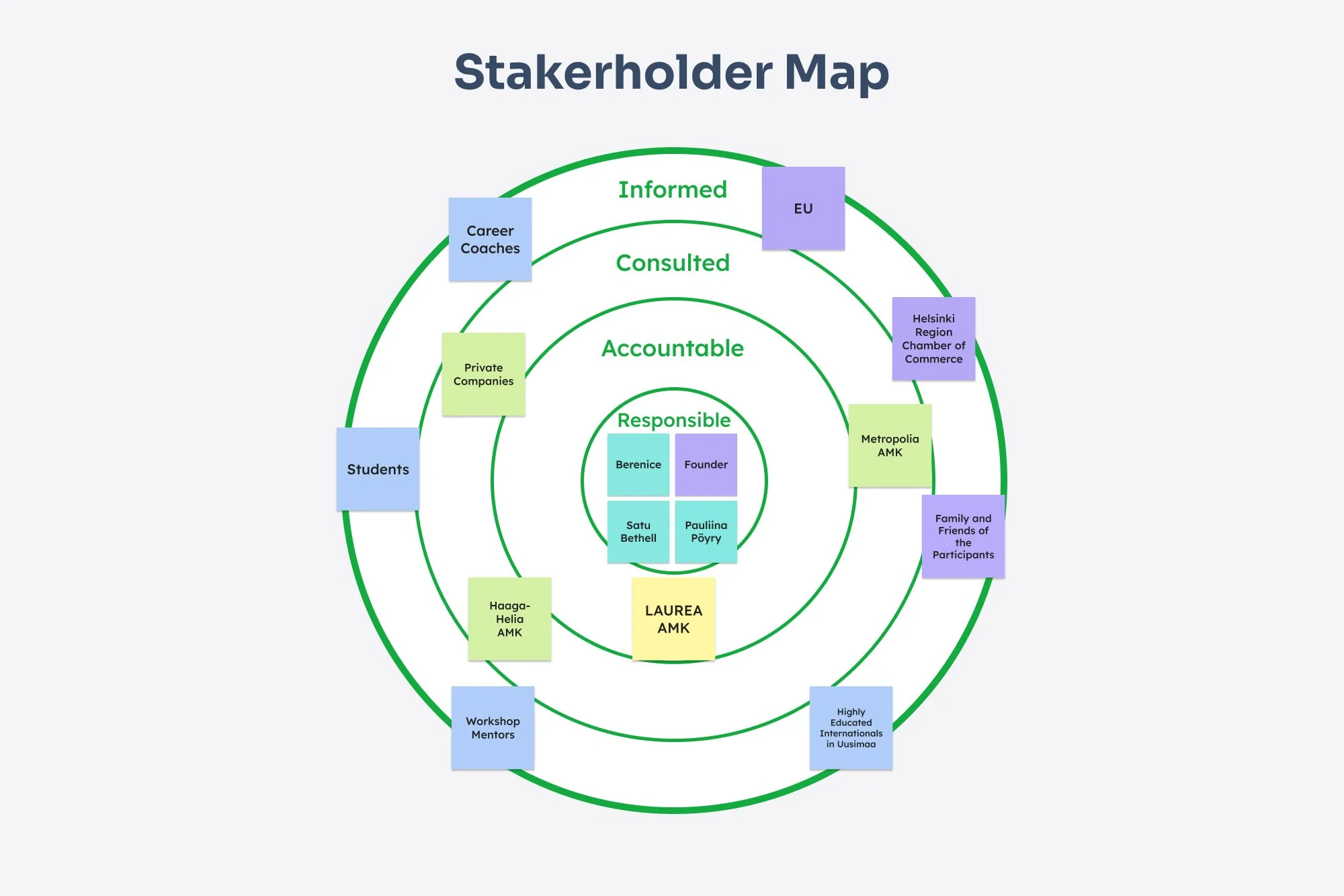
The Stakeholder Map helps to identify key roles and relationships, showing Berenice's team as responsible and the universities as core partners.
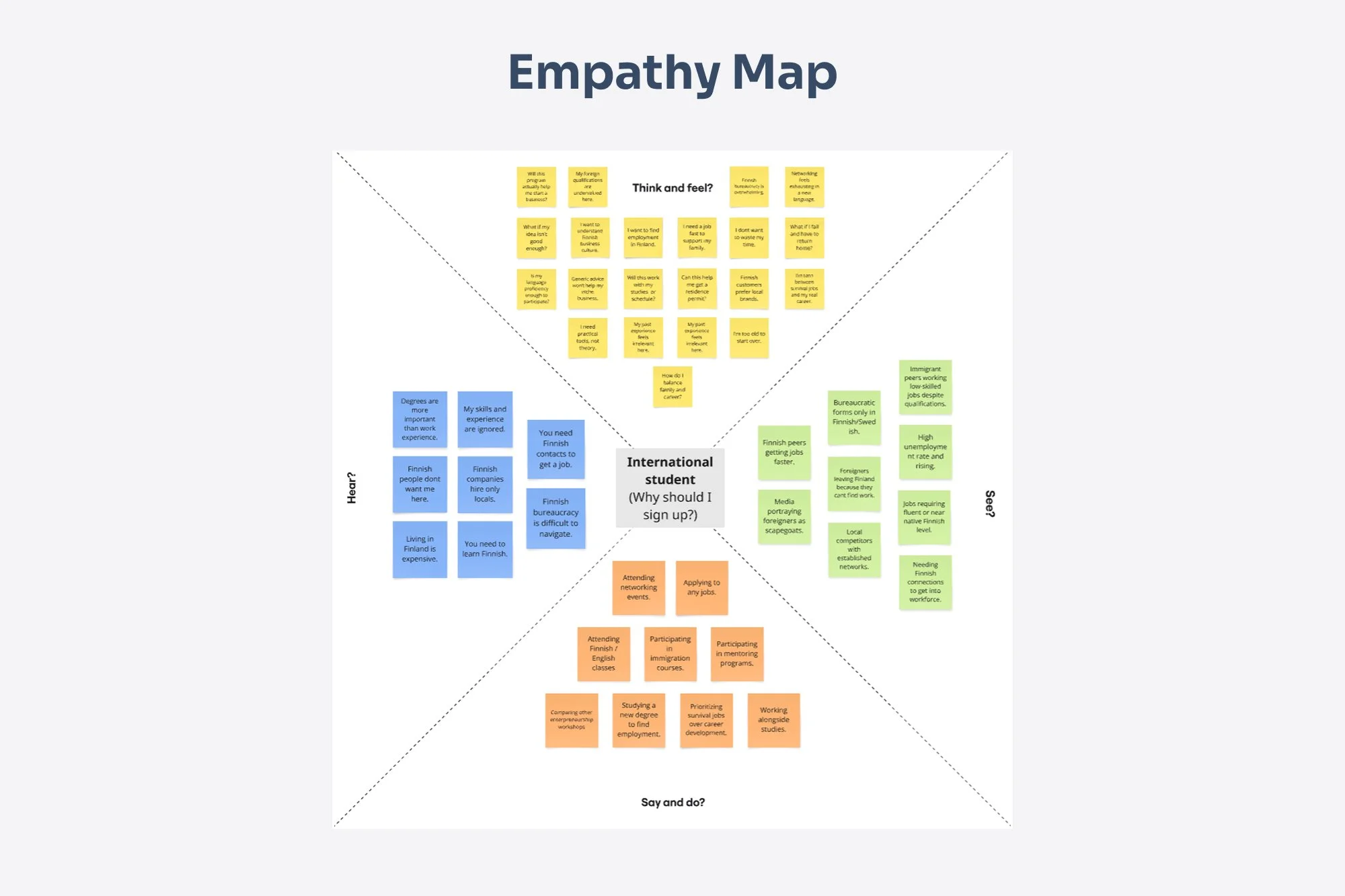
The Empathy Map uncovers motivations behind users' desire for practical support, as well as their underlying fears of failure and systemic barriers.
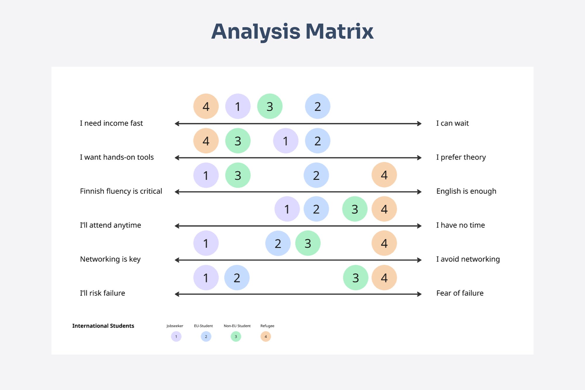
The Analysis Matrix helps to identify key priorities across user groups, showing critical differences in needs for income, networking, and language skills.
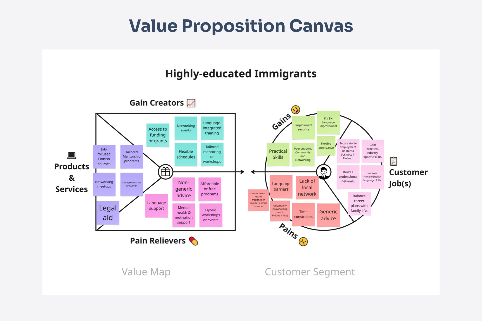
The Value Proposition Canvas helps to identify key alignments between the target audience's needs and program offerings.
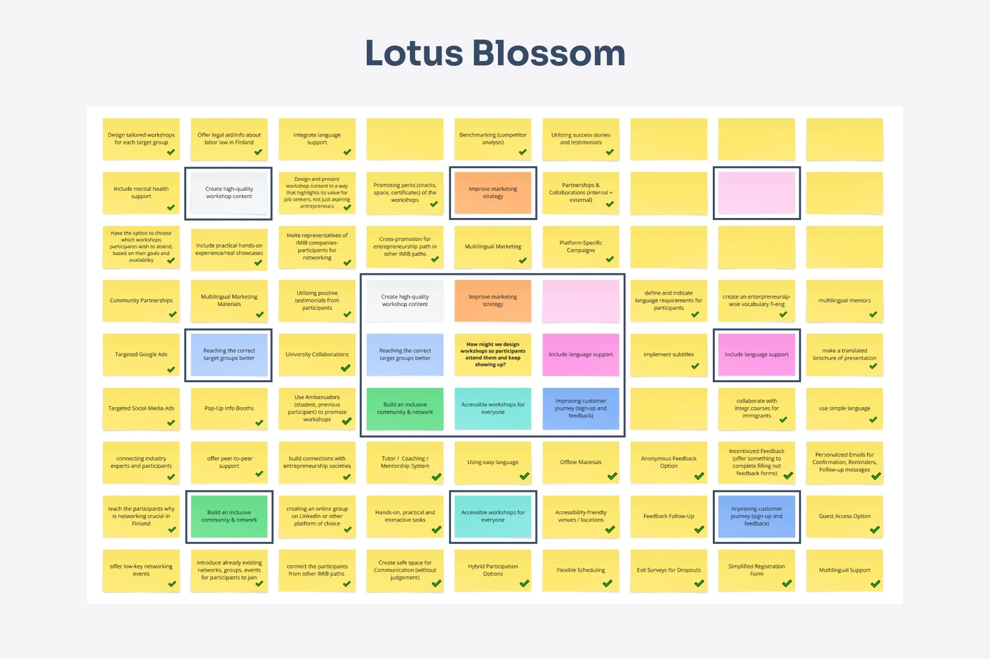
The Lotus Blossom technique helps to identify key solution areas for participant engagement, spanning marketing, accessibility, and community building.
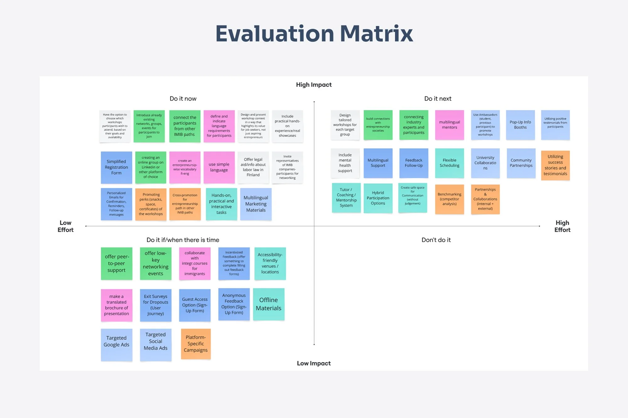
The Evaluation Matrix helps to identify key priorities, scoring solutions based on impact and feasibility to select the most effective improvements.
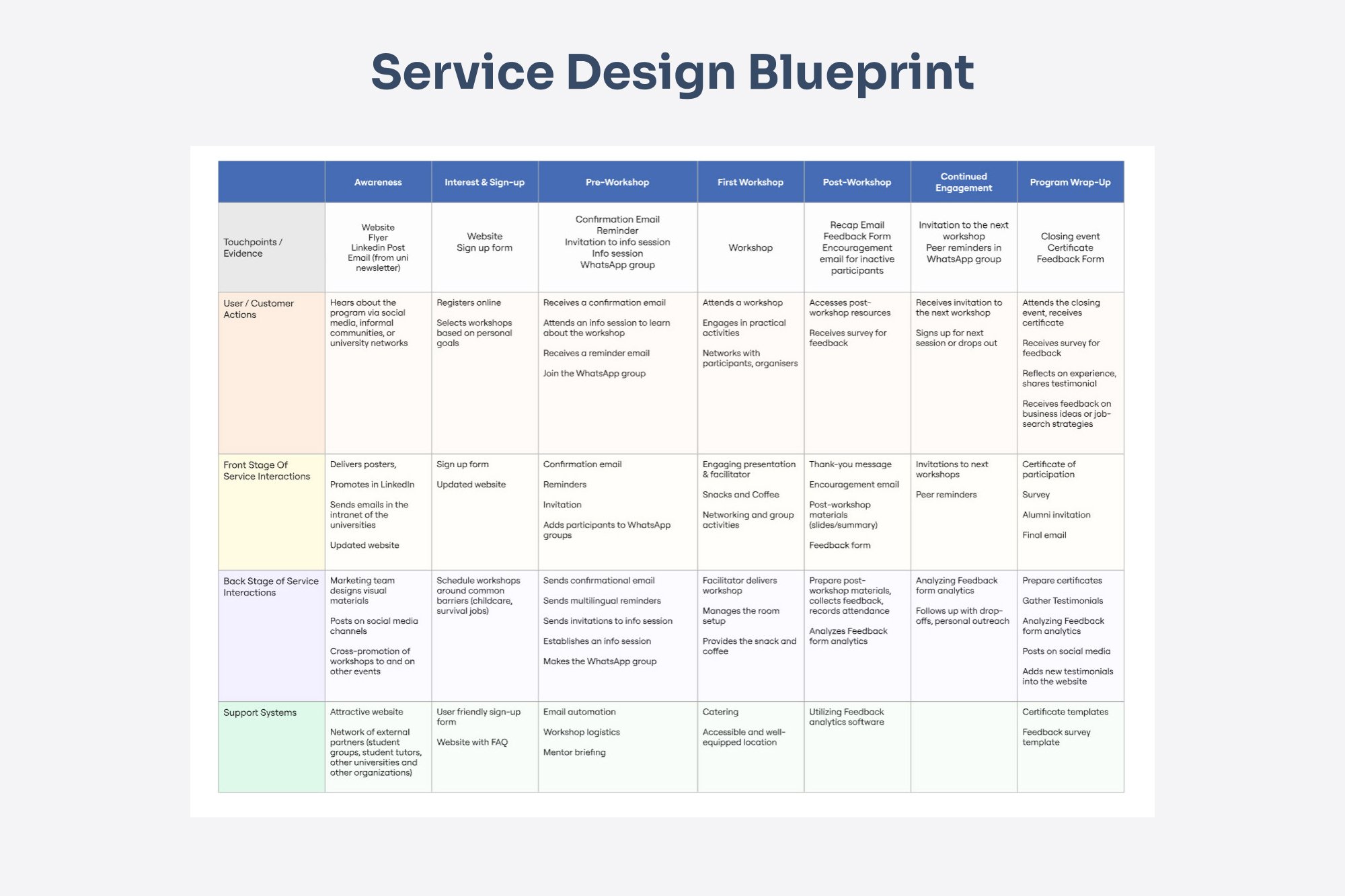
The Service Blueprint maps all key interactions and internal processes needed for a seamless workshop experience.
The final design stage was about turning insight into experience. Working side by side, we shaped every touchpoint: from flyer to sign‑up form to guide users smoothly from curiosity to commitment, ensuring each step felt natural and inviting.
Design Highlights
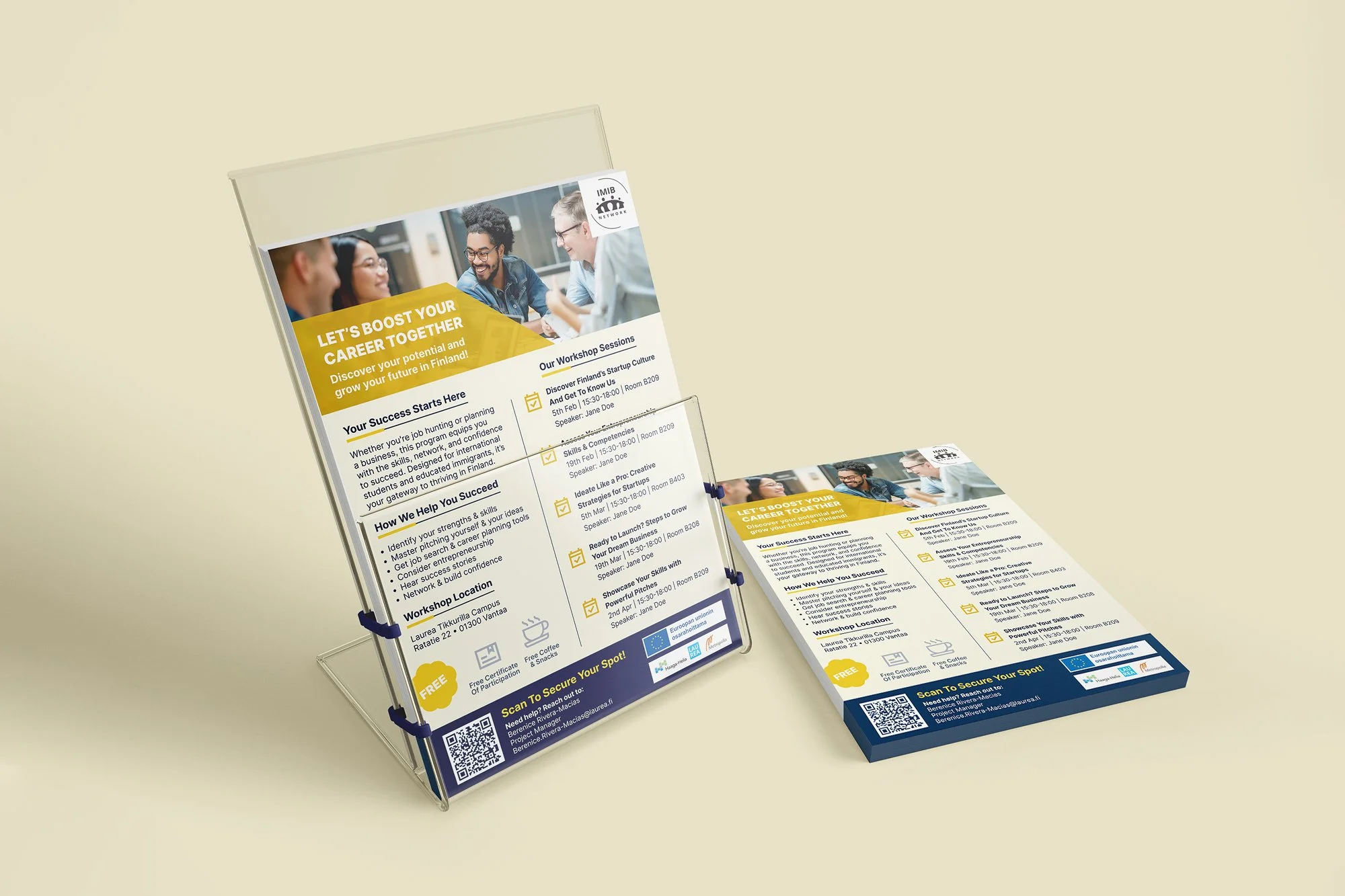
The final phase focused on collaboration and refinement. Together, we designed and tested the flyer, sign‑up form, and landing page to create a seamless experience from discovery to registration.
I refined the flyer’s layout and visuals to improve clarity and engagement while working with Lan Anh to co‑design the landing page based on user feedback. Each element supported the next, forming a cohesive journey that felt intuitive, consistent, and genuinely welcoming.
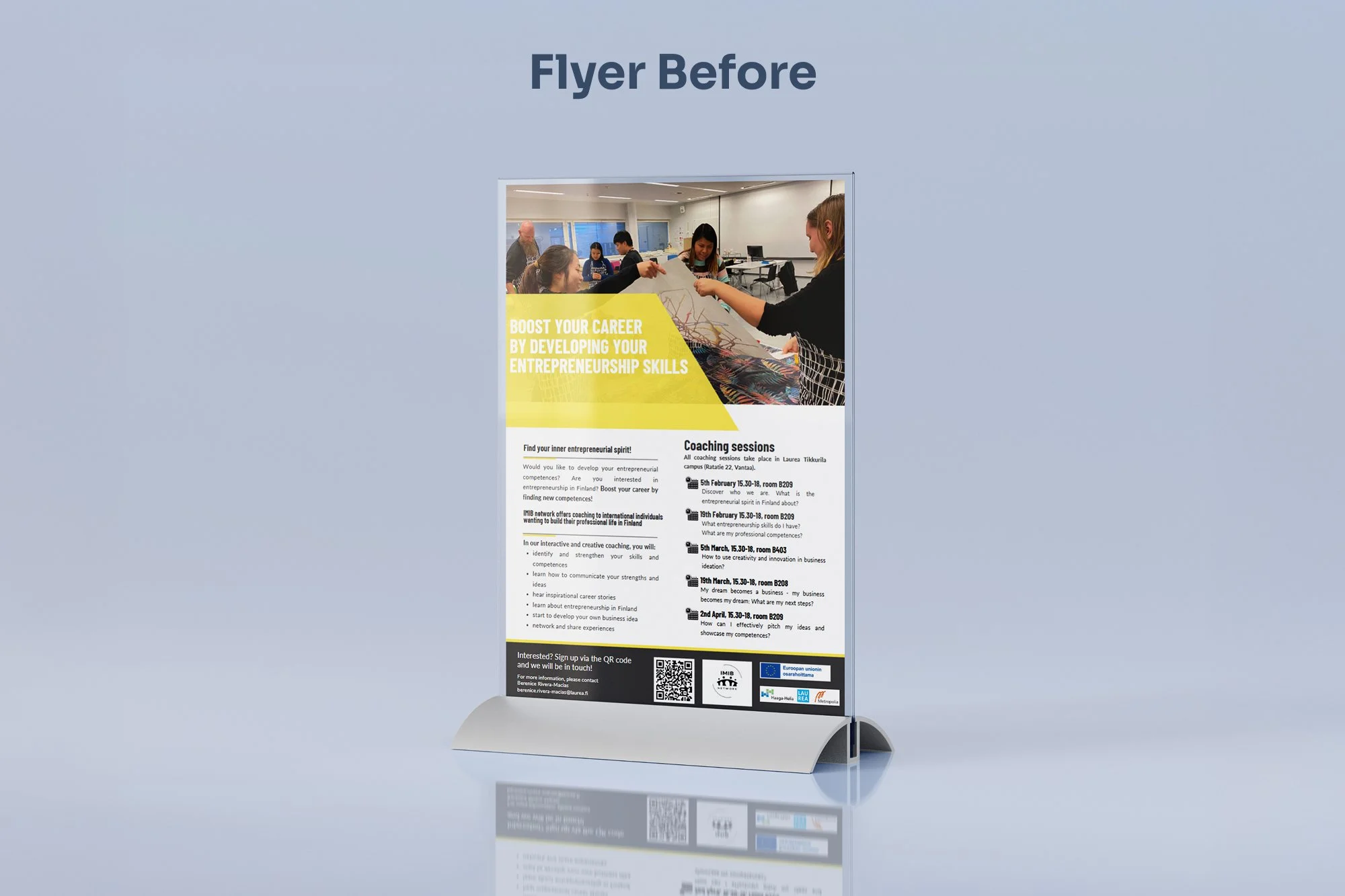
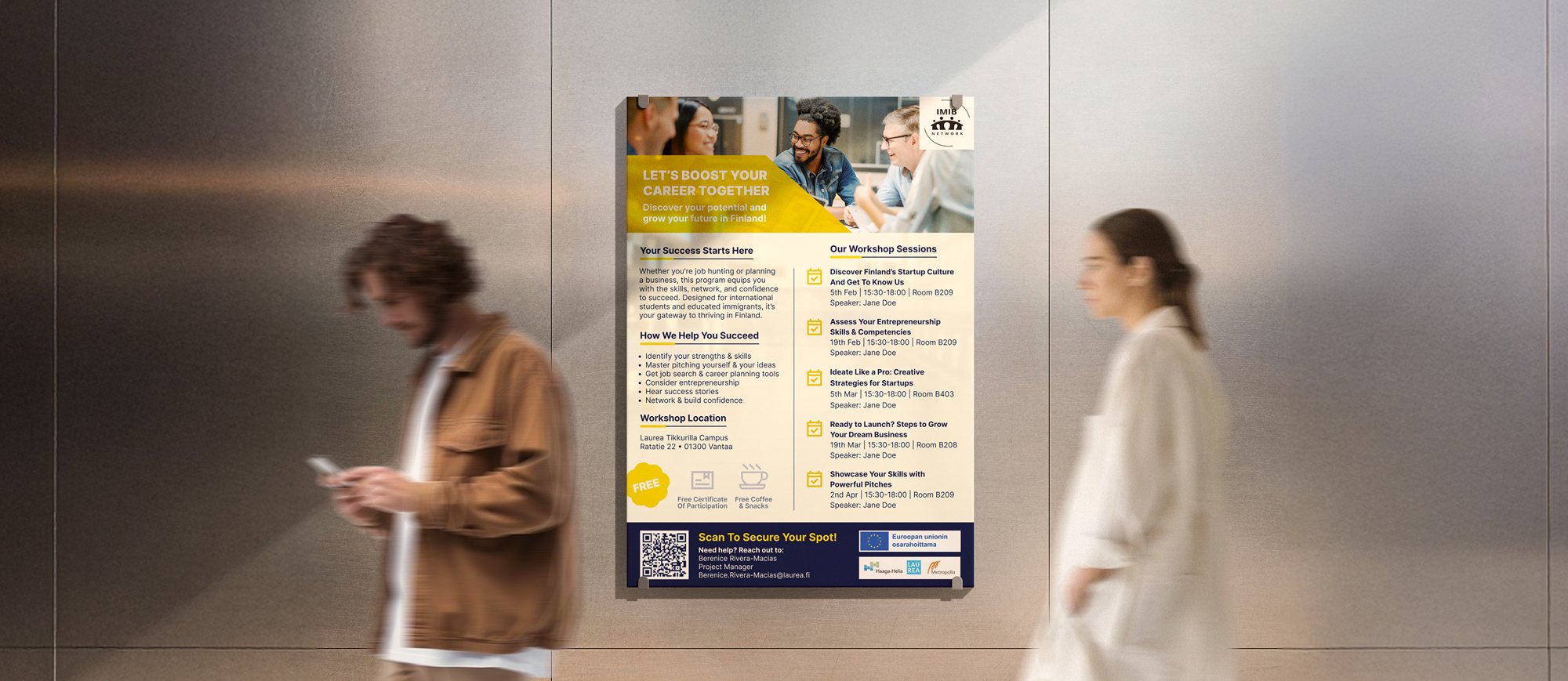
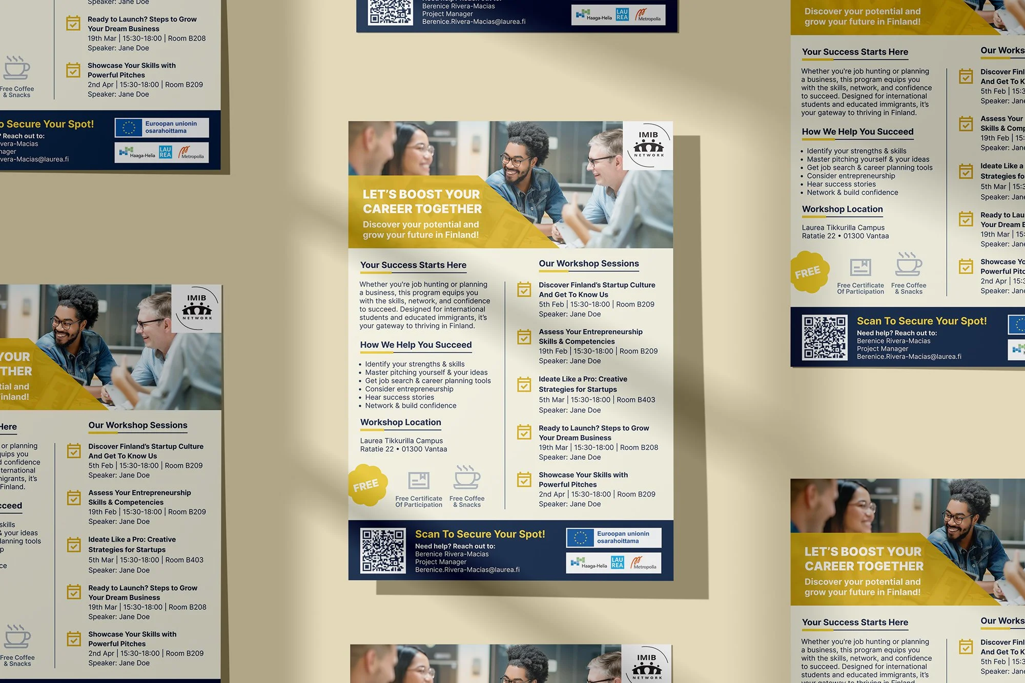
The original flyer used abstract language and a text-heavy layout, lacking clear incentives and specific speaker information to build trust.
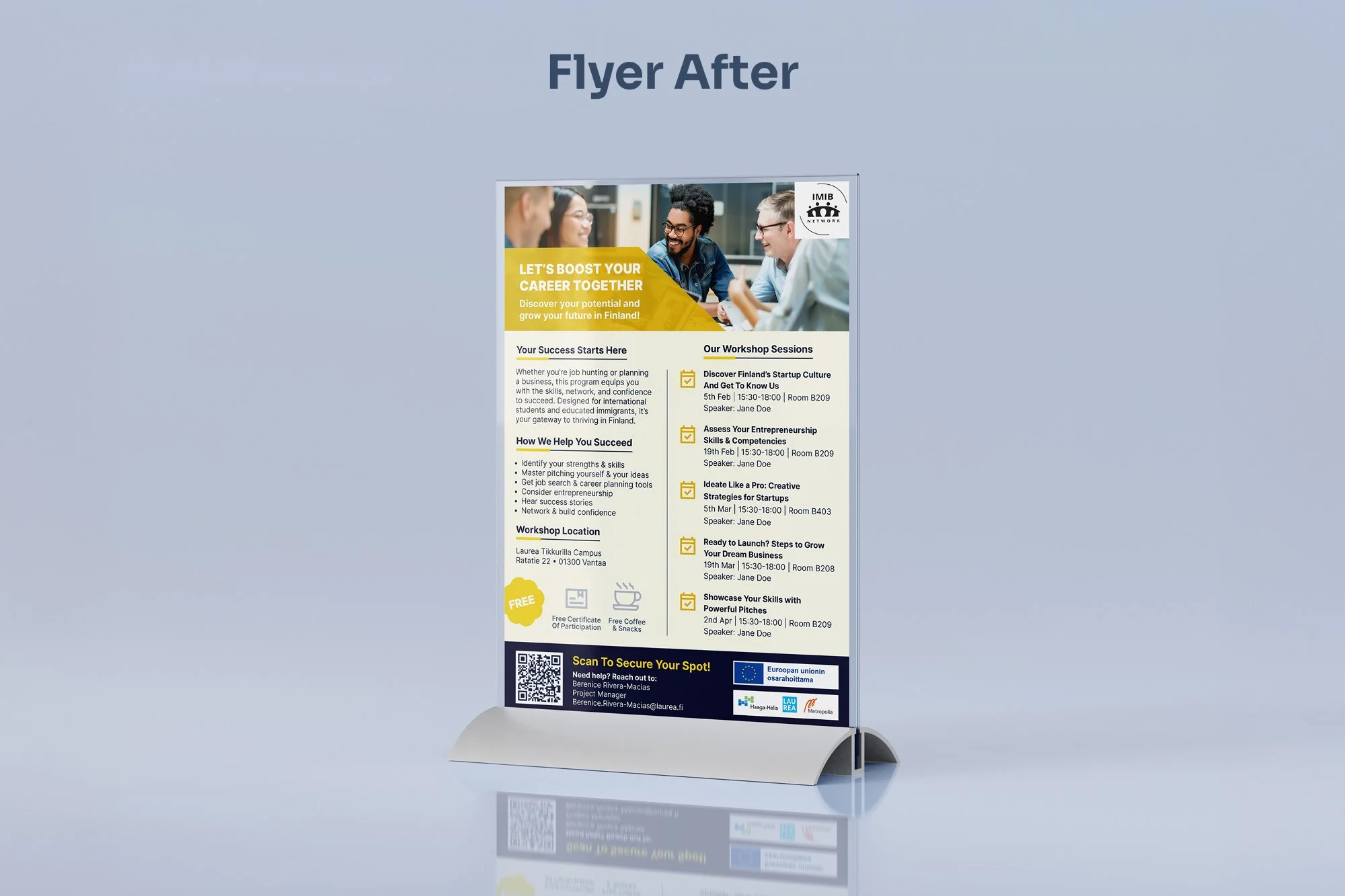
The new flyer builds trust with clear benefits, key perks, and a scannable layout featuring speaker details.
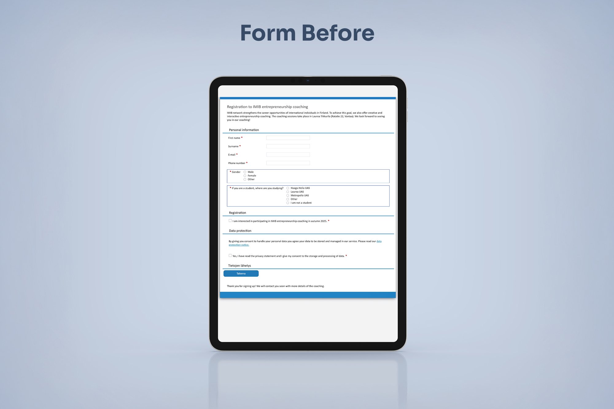
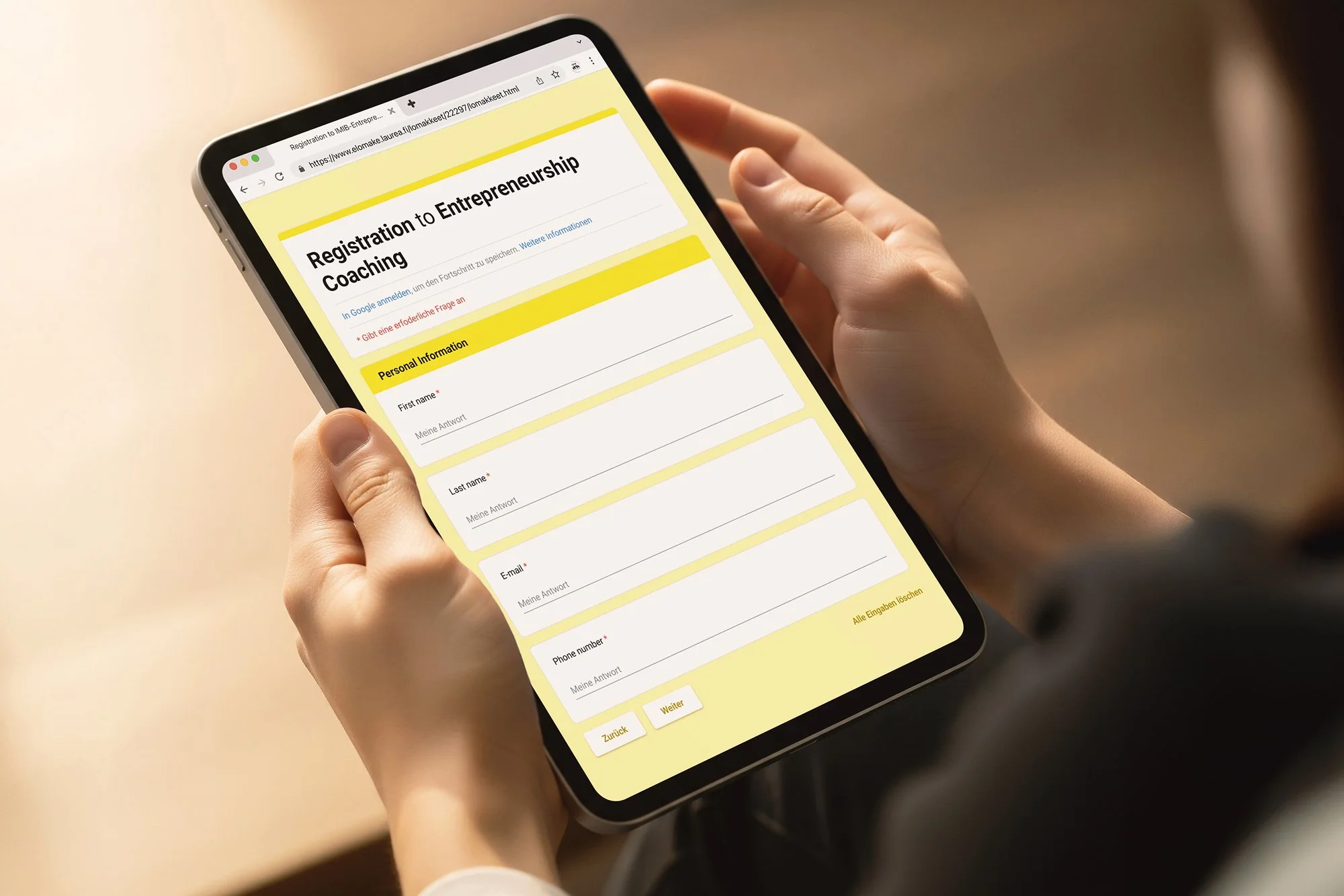
The original form functioned as a basic contact list, lacking questions about user goals and requiring a non-specific commitment to the entire program.
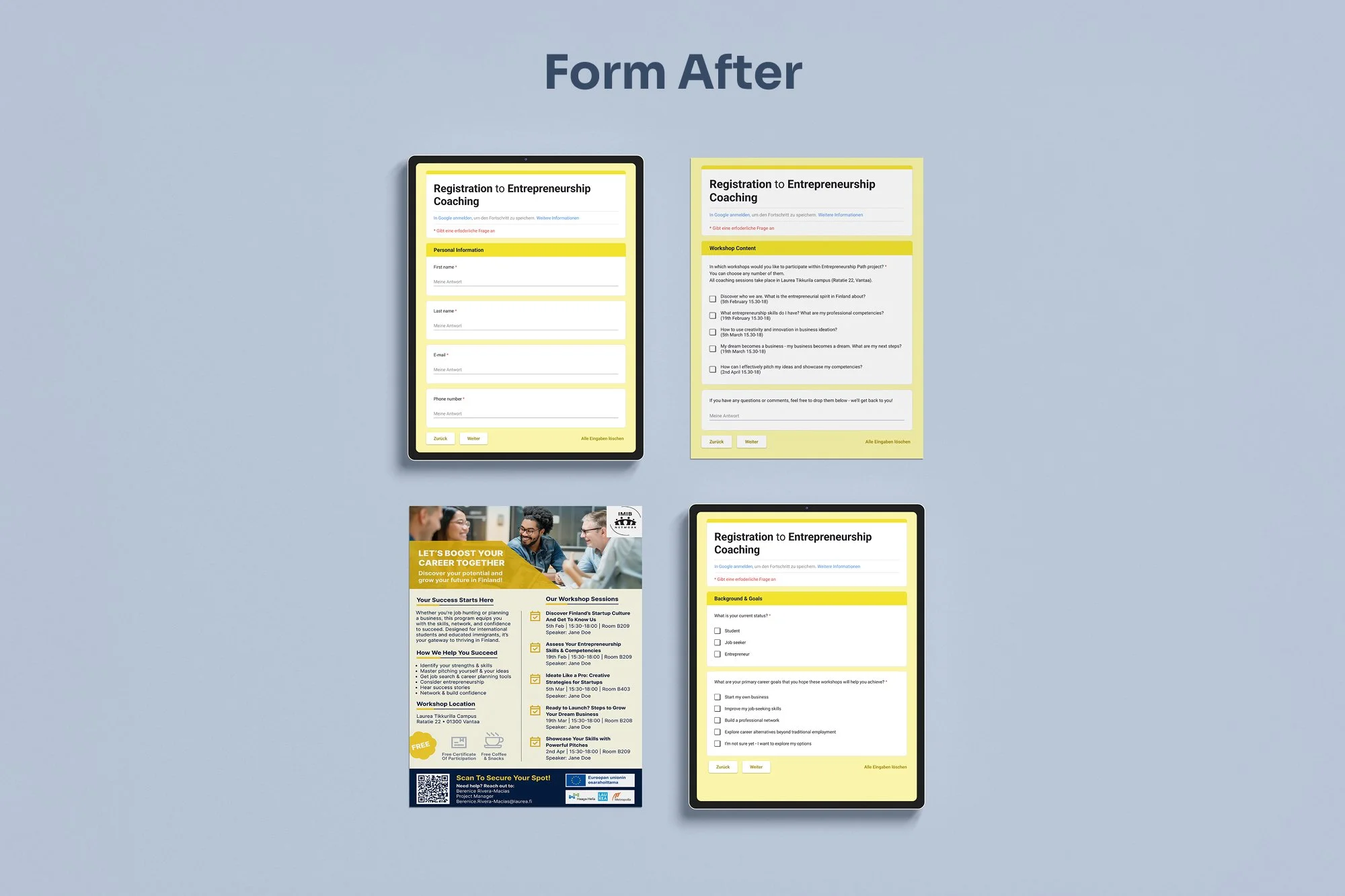
The redesigned form boosts intentional sign-ups by gathering user goals and introducing flexible, per-workshop registration.
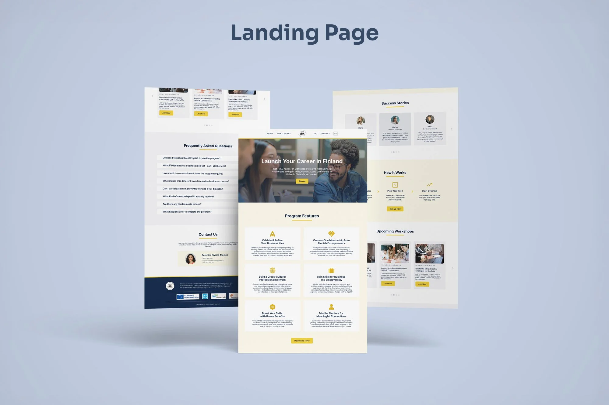
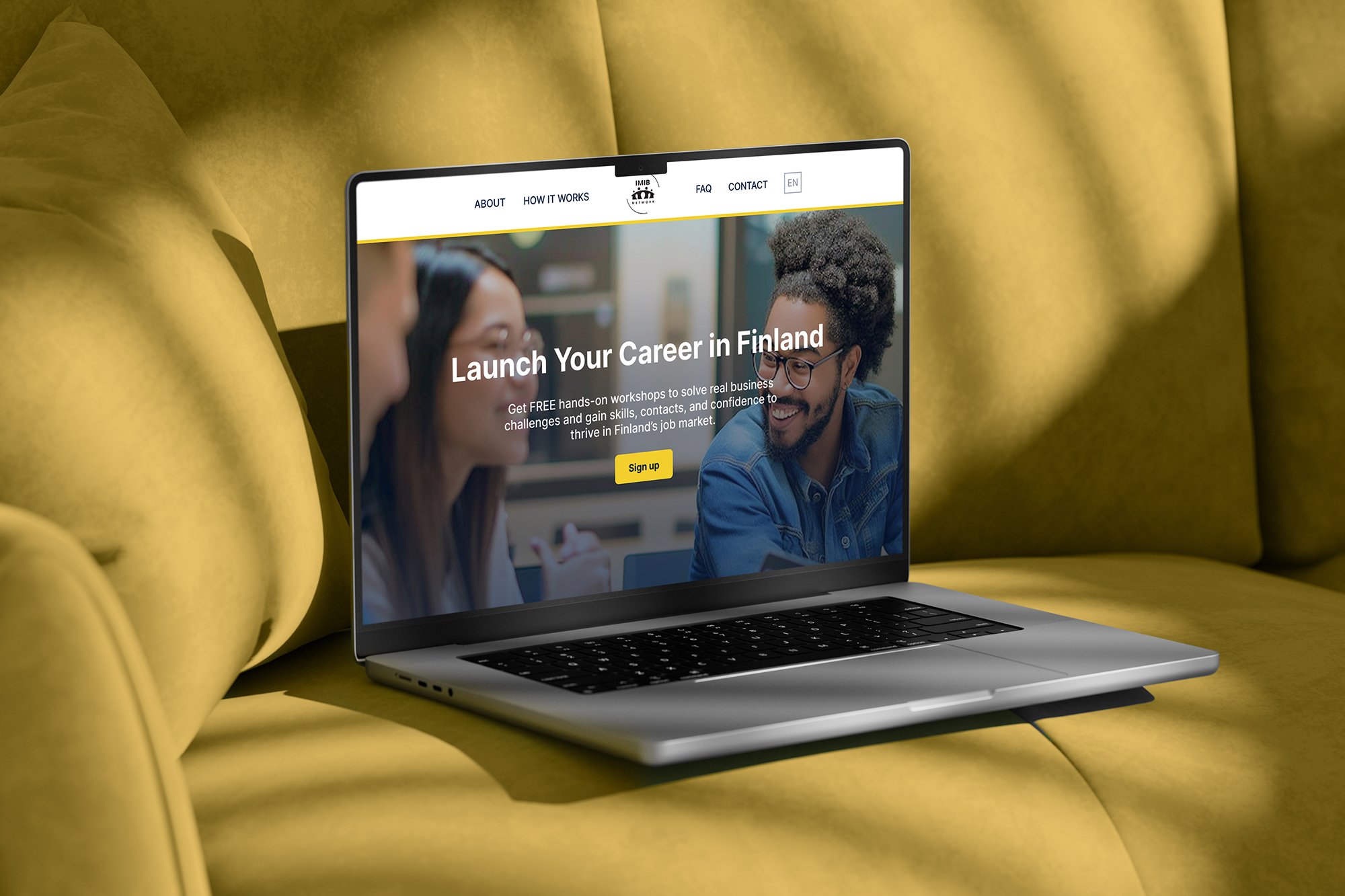
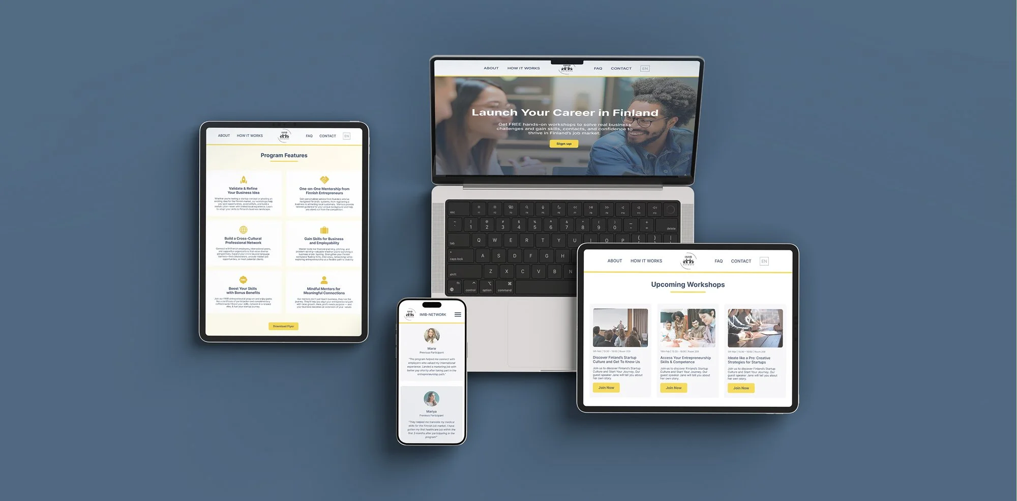
The redesigned layout uses clear visual hierarchy, scannable sections, and strategic white space to create an intuitive and engaging user journey.
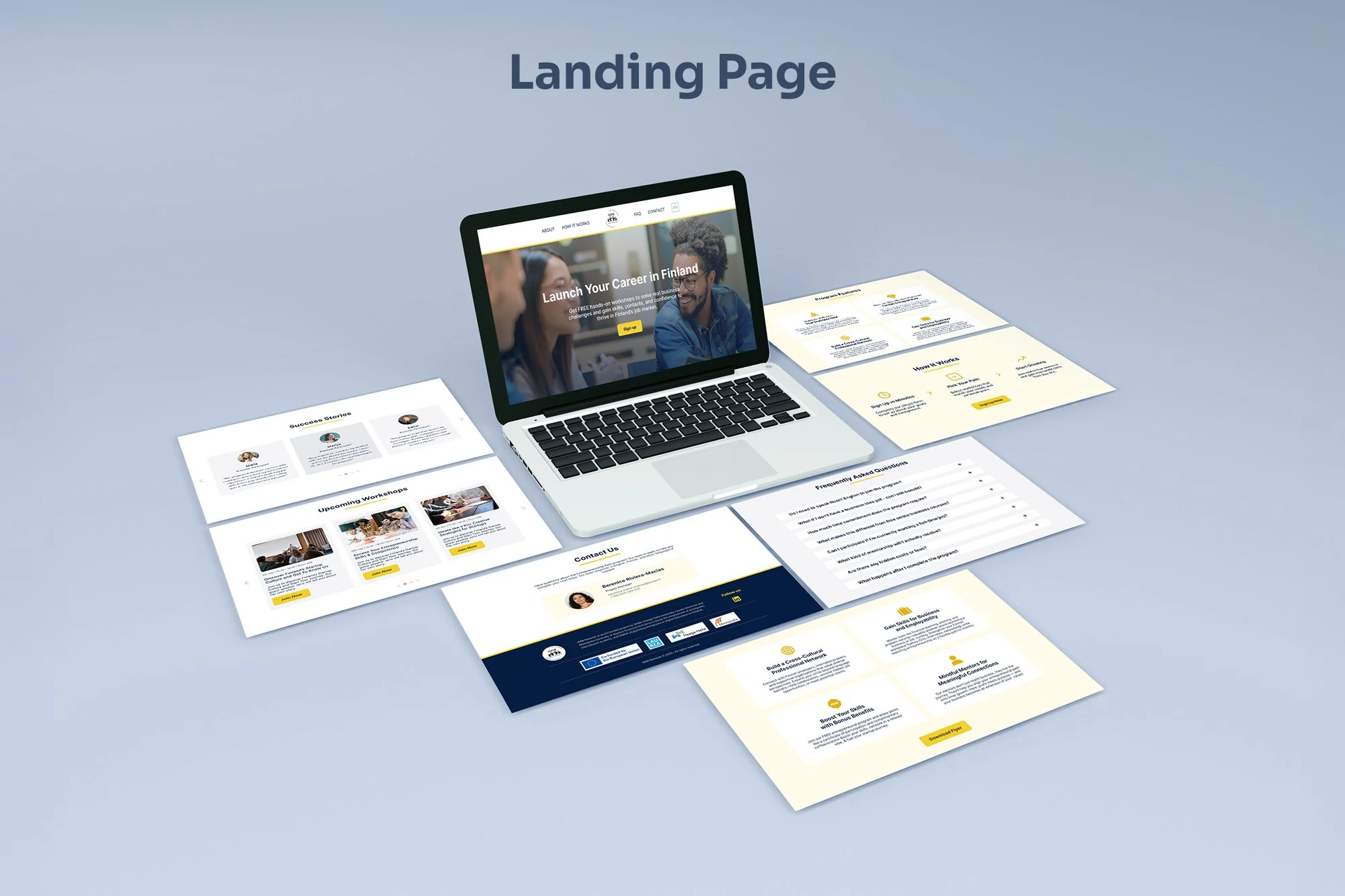
The new landing page builds trust and drives sign-ups with strong testimonials, a clear value proposition, and a streamlined registration path.
The project’s success wasn’t just in prototypes but in direction. Our research turned into a clear plan the client could act on: one that replaced confusion with confidence and built the foundation for lasting engagement.
Project Impact
Although full metrics are still to come, the project’s impact was immediate. The client welcomed our user‑driven solutions and planned to adopt the redesigned sign‑up form and flyer to improve attendance.
Our deliverables offered a full roadmap: a service blueprint outlining the ecosystem and a landing page strategy that unified all information. Together, these tools equipped the client to rebuild the participant journey with greater clarity, ease, and trust.
This project reminded me that good design thrives on collaboration. Working with a supportive team and an engaged client turned challenges into shared problem‑solving, showing how openness and clear communication drive meaningful results.
What Stayed With Me
This project showed me how essential collaboration and communication are in design. Our team’s shared vision and the client’s openness created a partnership built on trust and momentum. I especially valued shaping presentations that turned complex research into clear, engaging stories.
This experience reinforced that in service design, simple and honest communication can be the strongest design tool of all.
This also might be interesting
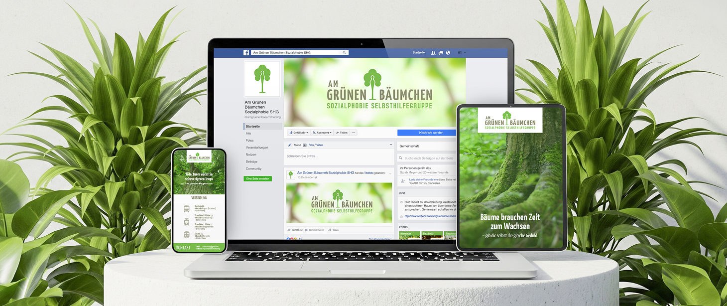
Am Grünen Bäumchen
Gentle identity for a mental health support group to built trust and understanding.
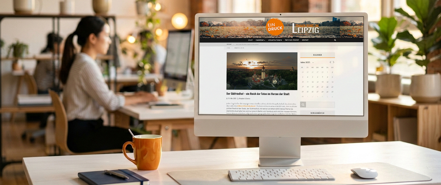
Eindruck
Eindruck highlights overlooked projects through curated editorials and thoughtful features.
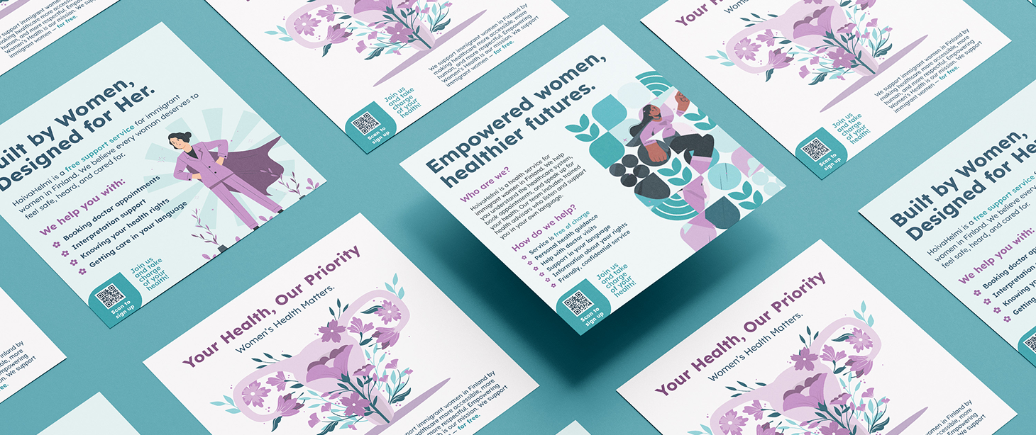
HoivaHelmi
Clear identity for women navigating Finnish healthcare through thoughtful design.
