
From Shadow to Spotlight
Industry: Social Services
Role: Co-Founder & Sole Graphic Designer
Team: Three co-founders
Timeline: 6 months / 2017 - 2018
Deliverables:
• Brand Strategy & Positioning
• Visual Identity
• Marketing Materials
• Social Media Marketing
Schattensprünge is a non-profit support group for young adults experiencing social anxiety. Founded in 2017 by peers from the "Am Grünen Bäumchen" group, we provided a supportive, non-judgmental space for members to gradually confront feared social situations through exposure therapy activities.
The group met in various public establishments like cafes and cinemas to practice skills, disconfirm fear-based beliefs, and experience life despite anxiety.


The Engagement Paradox
The core challenge remained - reaching an audience inherently hesitant to be reached. The biggest hurdle was convincing them to voluntarily enter the exact social situations they feared. This meant overcoming immense initial resistance to simply show up, then persuading them to actively participate. It required participants to possess a baseline level of coping skills and flexibility, which many felt they lacked.
Addressing this was critical because existing support often occurred in sterile, clinical settings, discussing hypotheticals rather than practicing real-life interactions. There was a clear gap for a proactive, activity-based group specifically for 20–45-year-olds that moved beyond talk therapy into practical, experiential learning.
We overcame this through persistent encouragement, leveraging my co-founders' proactivity and my own design and leadership experience from "Am Grünen Bäumchen." We used targeted Facebook marketing to create awareness and normalize the struggle, while I personally had to step outside my own comfort zone to model engagement and co-develop a calendar of accessible, gradual activities.
Defining the Audience
Building directly on our extensive research and firsthand experience from "Am Grünen Bäumchen," we possessed a proven blueprint of the local support landscape and its specific weaknesses. We knew traditional models often failed to engage young adults, operating in static environments that didn't mirror the unpredictable nature of real social anxiety triggers.
This prior insight confirmed a critical gap: the absence of a peer-run, exposure-focused group for the 20-45 demographic that embraced real-world practice. Our target audience was clear young adults in Leipzig with the active motivation to confront their fears, but who required a low-barrier, modern point of entry.
We understood that competitors lacked this specific community-driven and activity-based approach.
Consequently, our primary design strategy focused on creating a striking, welcoming brand to establish immediate trust and recognition, using dynamic visuals and a community-centric voice to motivate participation and significantly lower the threshold for that vital first contact.


Design Highlights
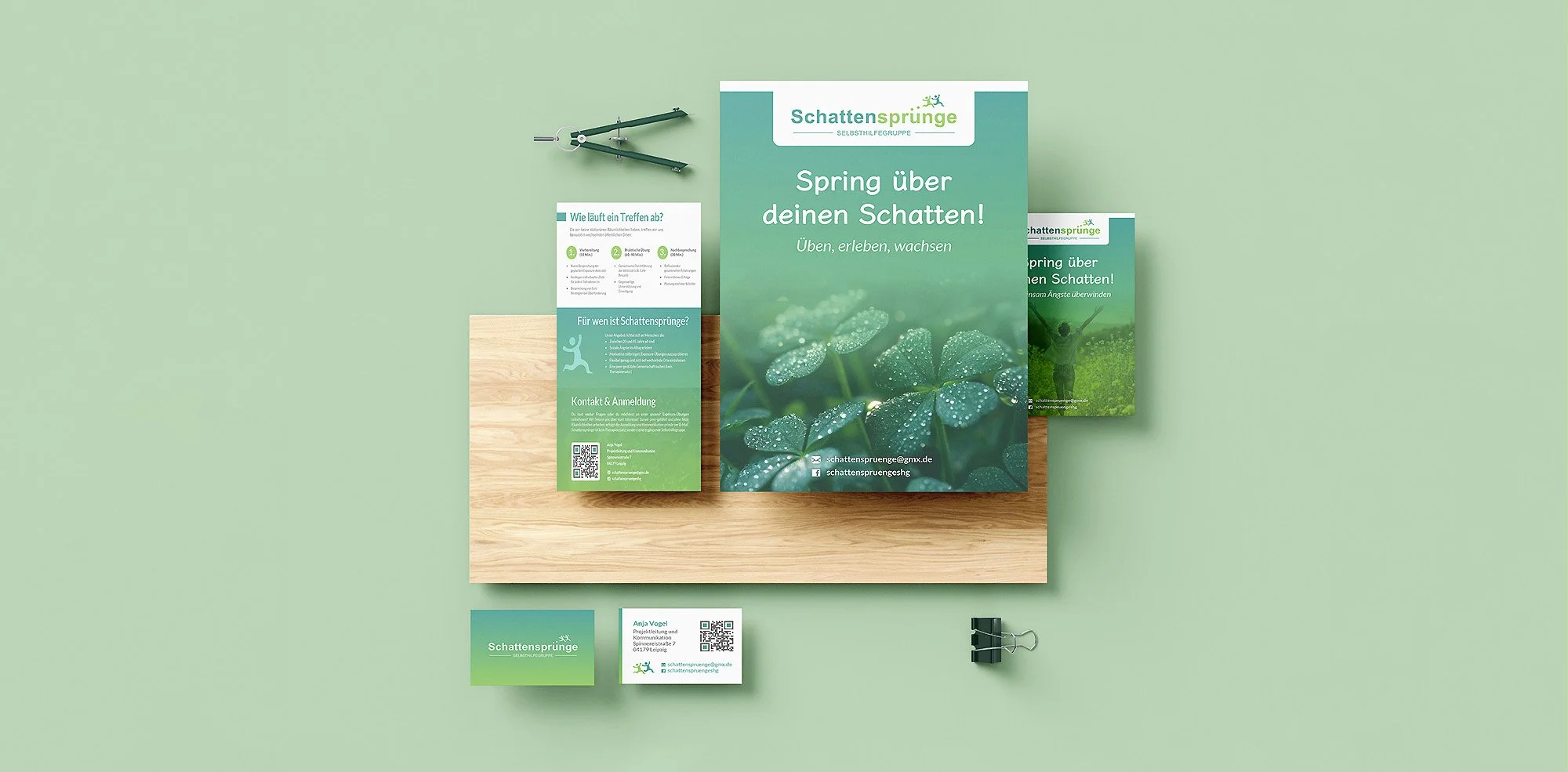
The visual identity for Schattensprünge was designed to be instantly welcoming and symbolically resonant. The name, translating to "shadow jumps," is based on the German proverb for overcoming one's fears, which directly inspired the core logo motif.
The logo combines a clean, friendly sans-serif typeface with a custom icon of two figures leaping over a dotted path. This symbolizes the members' journey from avoidance to action, progress, and mutual support.
A calming gradient from trusting teal to optimistic green visually reinforces this narrative of growth and emotional safety. The supporting Lato typography was chosen for its warm, rounded terminals that enhance approachability while maintaining professional clarity.
The broader palette incorporates stable neutral tones to ensure balance. Every element is intentionally crafted to feel non-clinical, supportive, and encouraging, effectively lowering the barrier to engagement for its target audience.


Project Impact
The new brand identity for Schattensprünge significantly strengthened its presence and resonance within the local community. The refreshed, welcoming visual language led to a marked increase in Facebook engagement and direct inquiries, translating into consistent attendance at regular peer-support meetings.
Qualitative feedback highlighted the profound human-centered impact: members and prospects consistently described the brand as "far more approachable," "less clinical," and "finally feeling like a community they could trust." The clear, warm aesthetics and symbolic logo effectively lowered the psychological barrier to entry, making the concept of exposure therapy feel accessible and safe.
Ultimately, the design succeeded in its core mission: transforming Schattensprünge into a visually cohesive and emotionally supportive community for those seeking to overcome social anxiety, proving that thoughtful design is critical in building trust and fostering human connection.

Looking Back
This project taught me how design can build trust and community for vulnerable groups. While proud of creating Schattensprünge's visual identity and growing its online presence, I learned difficult lessons about co-founder alignment.
My vision for community engagement diverged from my partners', leading to my departure in 2018. If I could do it differently, I would set clearer boundaries and communicate expectations more directly from the start. Though we parted on uncertain terms, the experience taught me that stepping away from something meaningful can sometimes be the right decision for personal and professional integrity.
This also might be interesting

Am Grünen Bäumchen
Am Grünen Bäumchen is a mental health group where walls come down. Finding peer support that doesn’t judge.

EinDruck
EinDruck shines a light on overlooked projects. The platform elevates nonprofit initiatives and community projects.

HoivaHelmi
HoivaHelmi is a fictive support service for immigrant women in Finland. The service helps with navigating healthcare services.