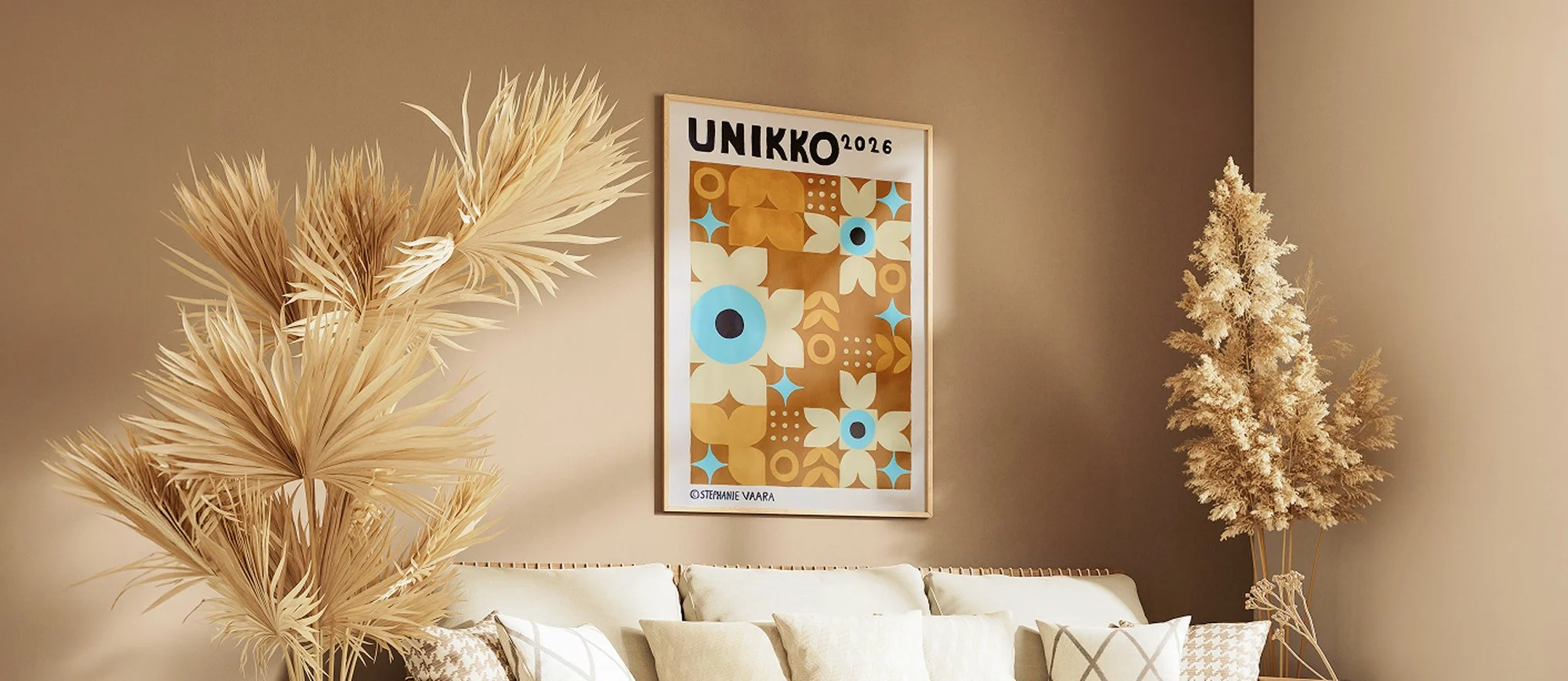
A German Take on Finnish Design
Type: Design study
Role: Designer & painter
Timeline: September - October / 2026
Deliverables:
• Acrylic poster (70 × 100 cm)
• Image analysis
• Work presentation
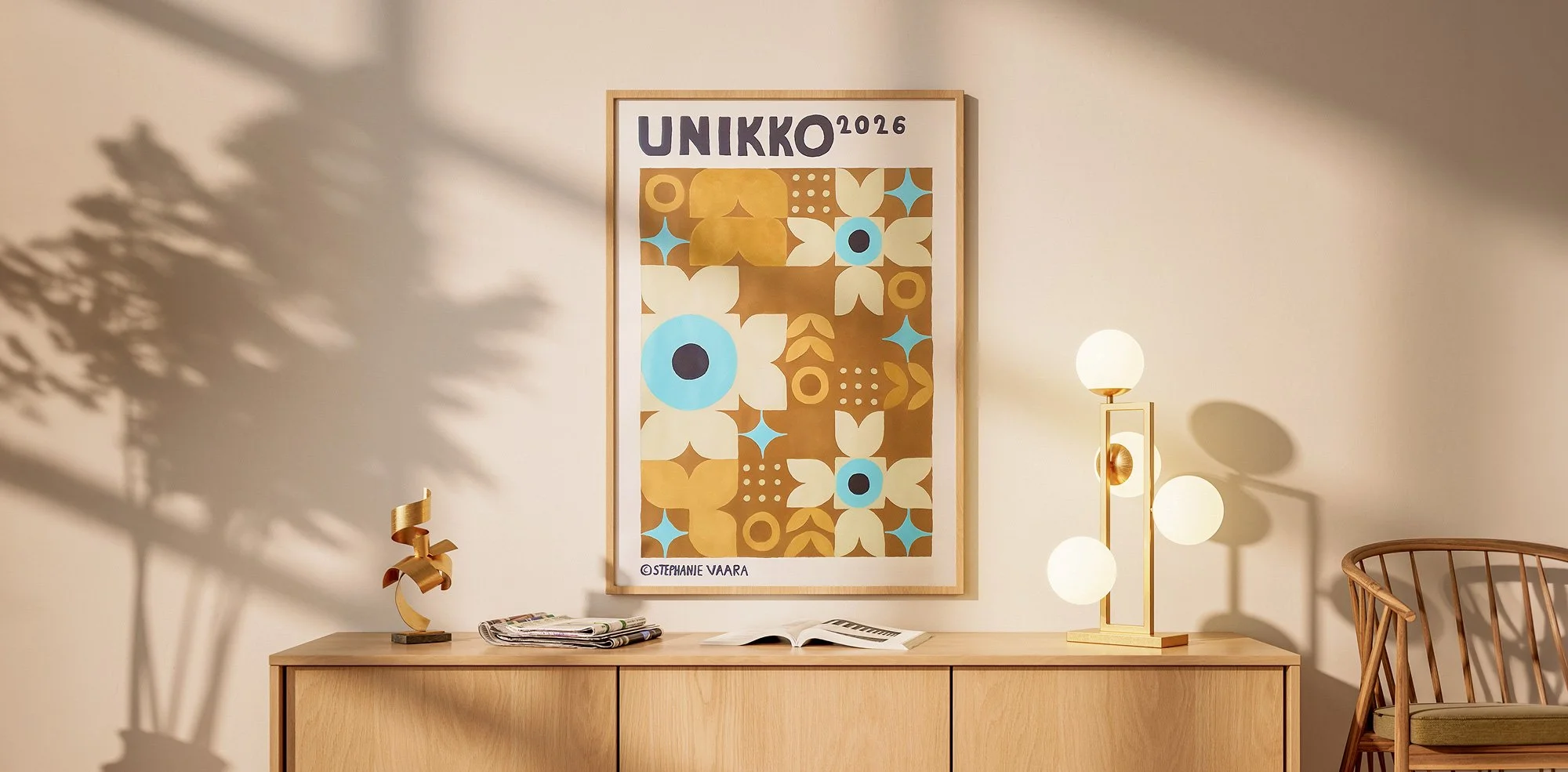
A hand-painted acrylic poster that joins Bauhaus geometry with Finland’s best-loved flower.
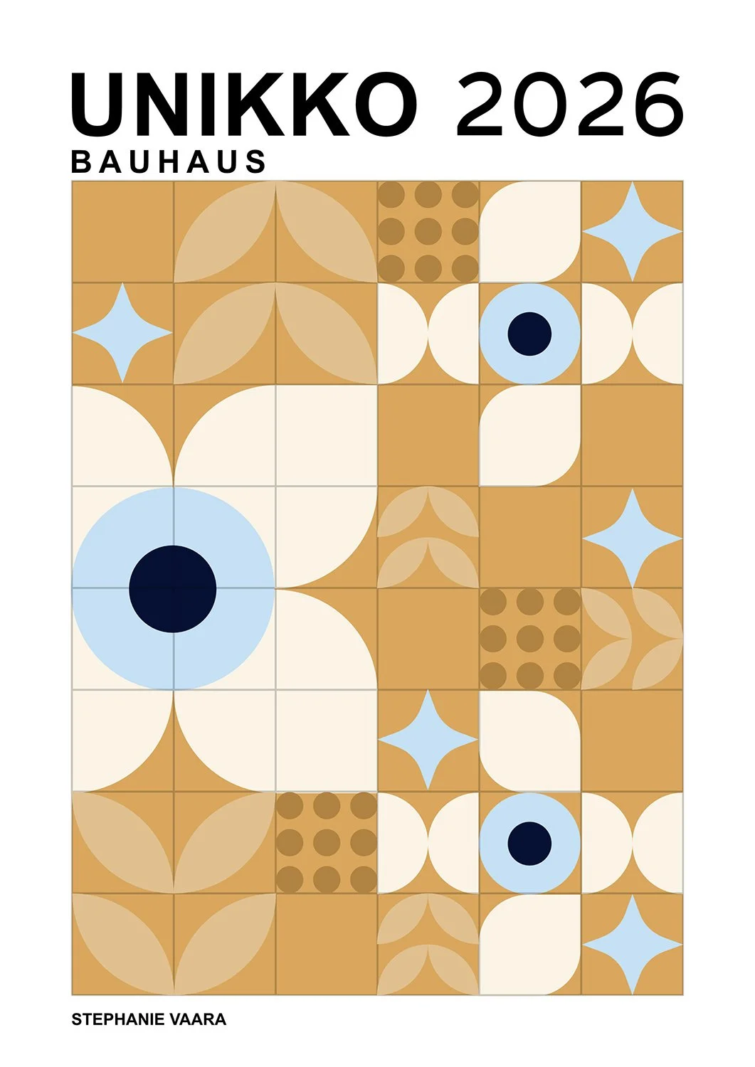
Unikko 2026 is a 70 × 100 cm acrylic poster. The brief: a poster inspired by a graphic design era. I paired Bauhaus order with Marimekko’s Unikko, drawn by Maija Isola, as a tribute to Finnish design, which I see every day in Oulu.
Facing the Paper
On screen the concept felt easy. On paper it needed a compass, a long ruler, and test sheets first. Nobody sees this part in the finished poster, but it is where the quiet steadiness of the painting came from.
The hardest part wasn’t the 70 x 100 cm format or the geometry. It was my own expectations: I wanted a clean, crisp result, I had little confidence in acrylic, and I had only one sheet and no second chance.
I built a solid digital concept first, then practiced my shapes with a drafting compass on test paper. I drew the full grid by hand on my apartment floor, which took a few hours and left my back complaining.
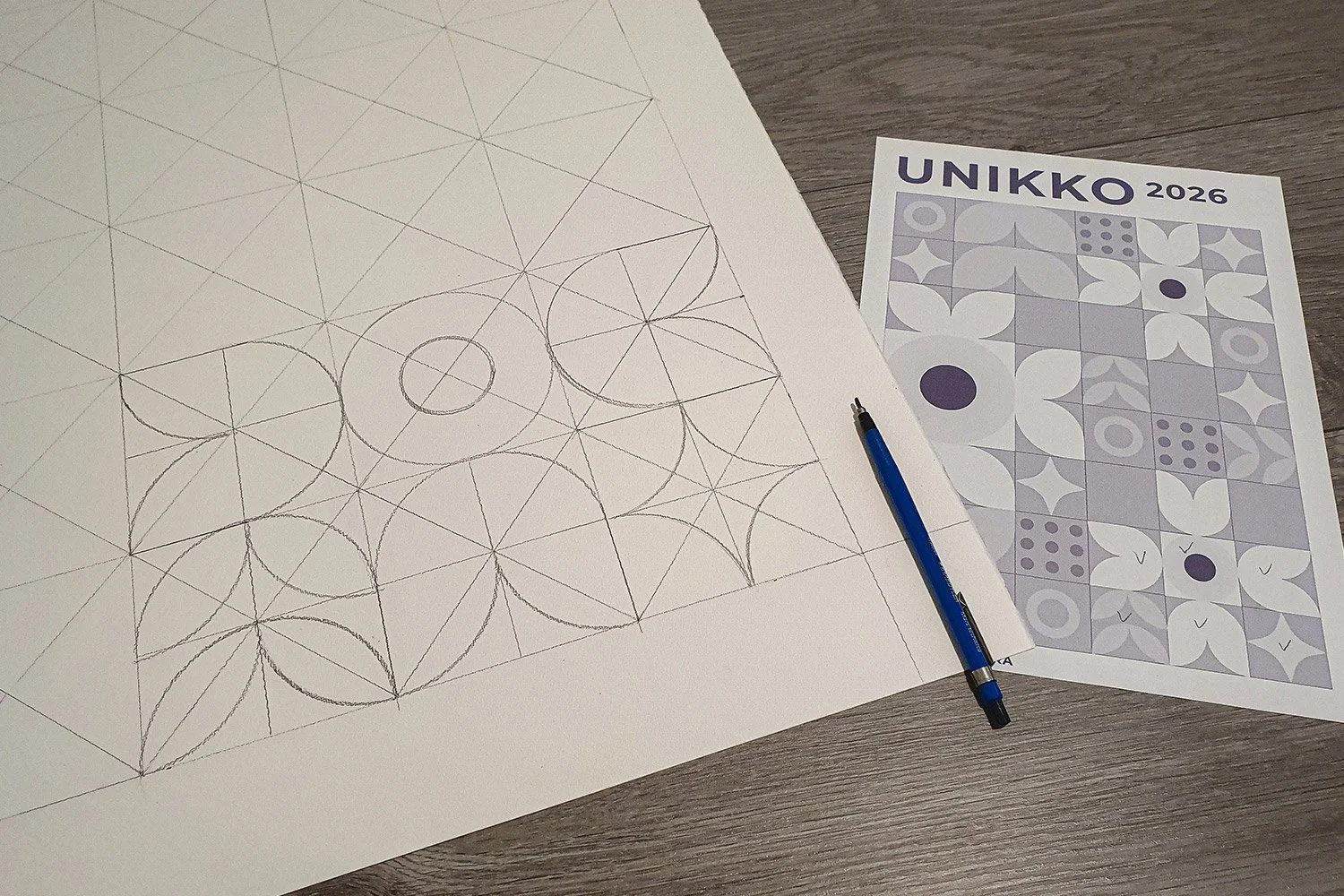
Printout sheet for grid creation
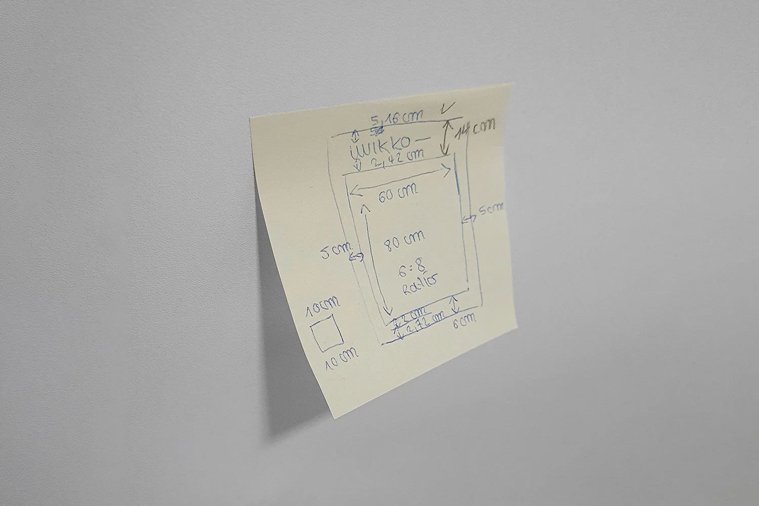
Measuring cheat sheet
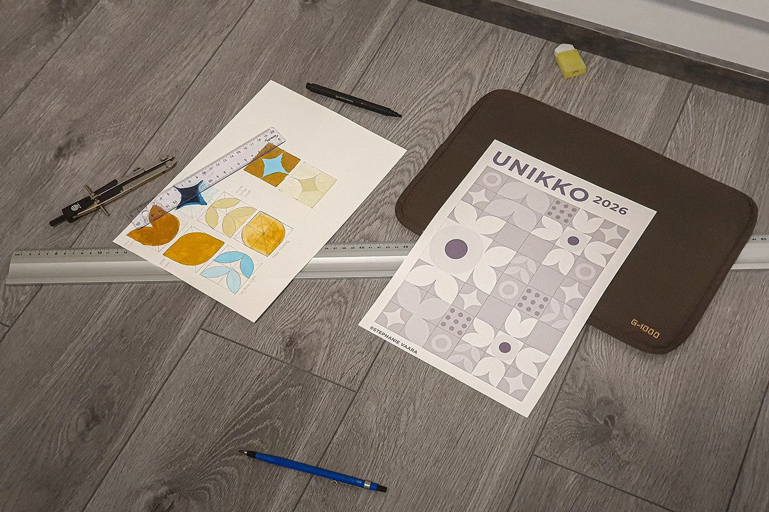
Testing sheets and used materials
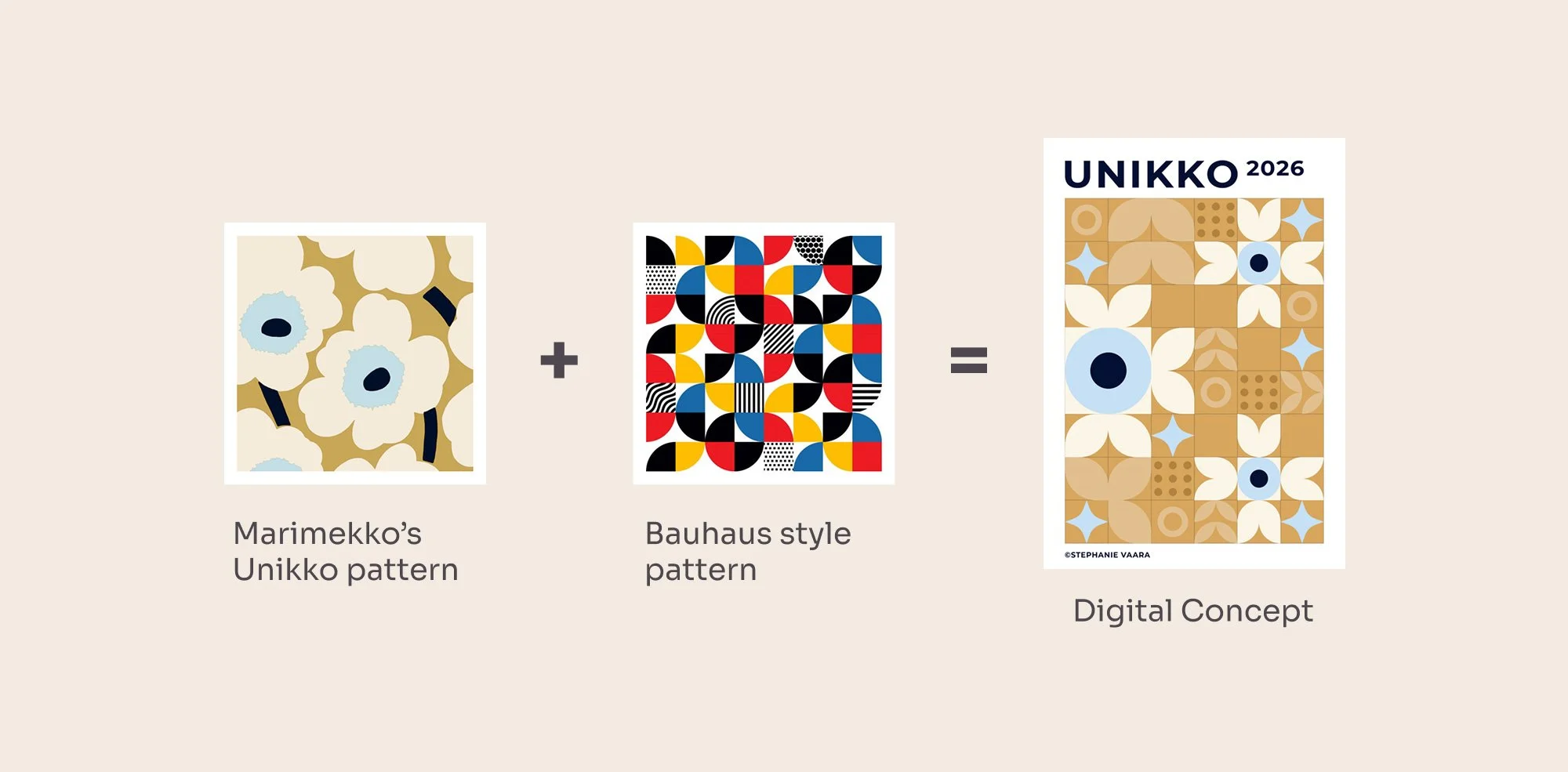
Conception: Simplifying the Flower
How do you make a flower made of soft curves feel like it was drawn with a compass and a ruler? Mostly by taking things away, patiently, until only the shape of the idea was left. That is how the concept found its quiet, geometric voice.
I knew fairly quickly what I wanted: a Finnish design classic meeting German geometric strictness. My first digital drafts stayed too close to Unikko itself, and they felt busy and overwhelming.
So I simplified, trying different visual styles and building organic petals from geometric shapes, with supporting shapes for balance and interest. It took several concepts before I was happy, and I did all of it digitally before committing to the full 70 x 100 cm sheet.
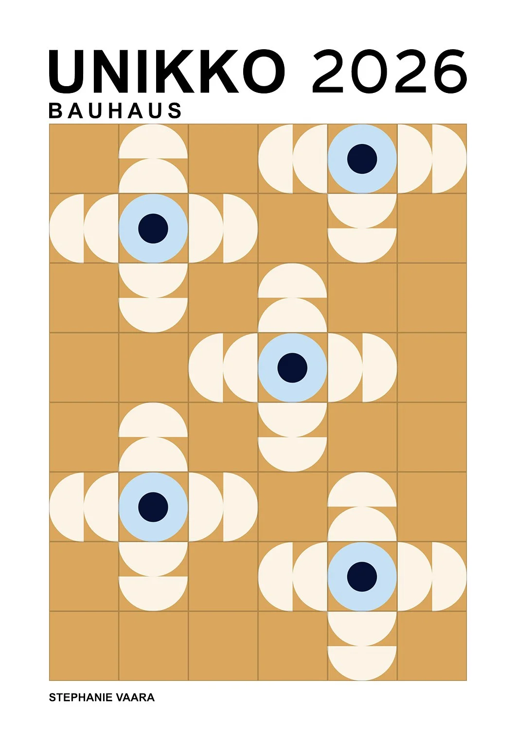
Initial concept
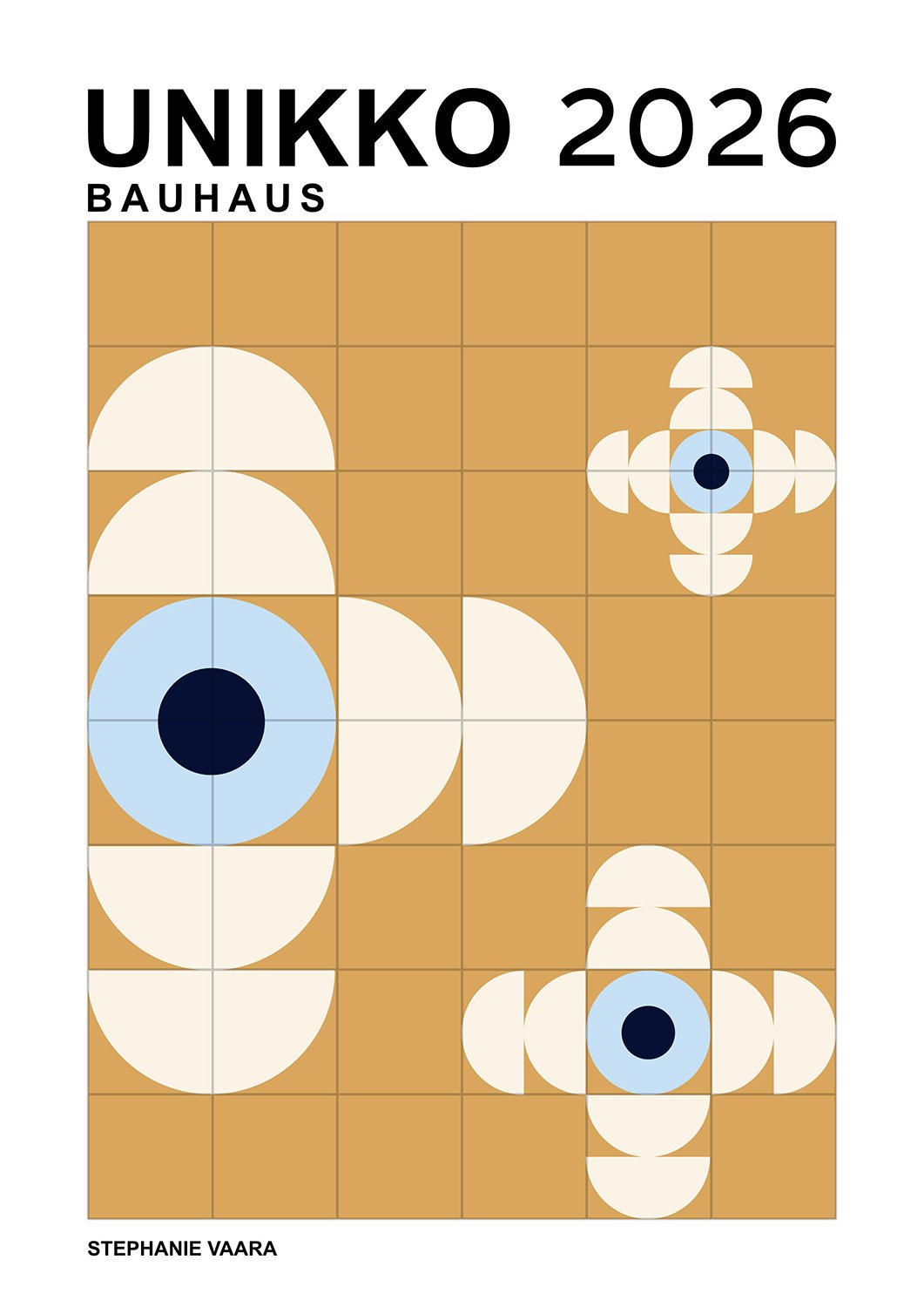
Simplified concept
Alternative shapes
Grid Creation by Hand
The grid was the part that I worried about the most and the part I am quietly proudest of. On screen it was simple, but copying it onto paper by hand took hours of careful measuring. Every shape that followed depended on it.
The 6 x 8 grid was the foundation, and transferring it from screen to paper was my biggest worry. It was easy to build digitally, but scaling it up by hand was stressful, and the design looked different at full size.
Every shape is a circle within a square, with diagonal lines crossing at each center. I practiced with the compass on test sheets first, then drew everything with a long aluminum ruler and plenty of patience, on the apartment floor, over a few hours.
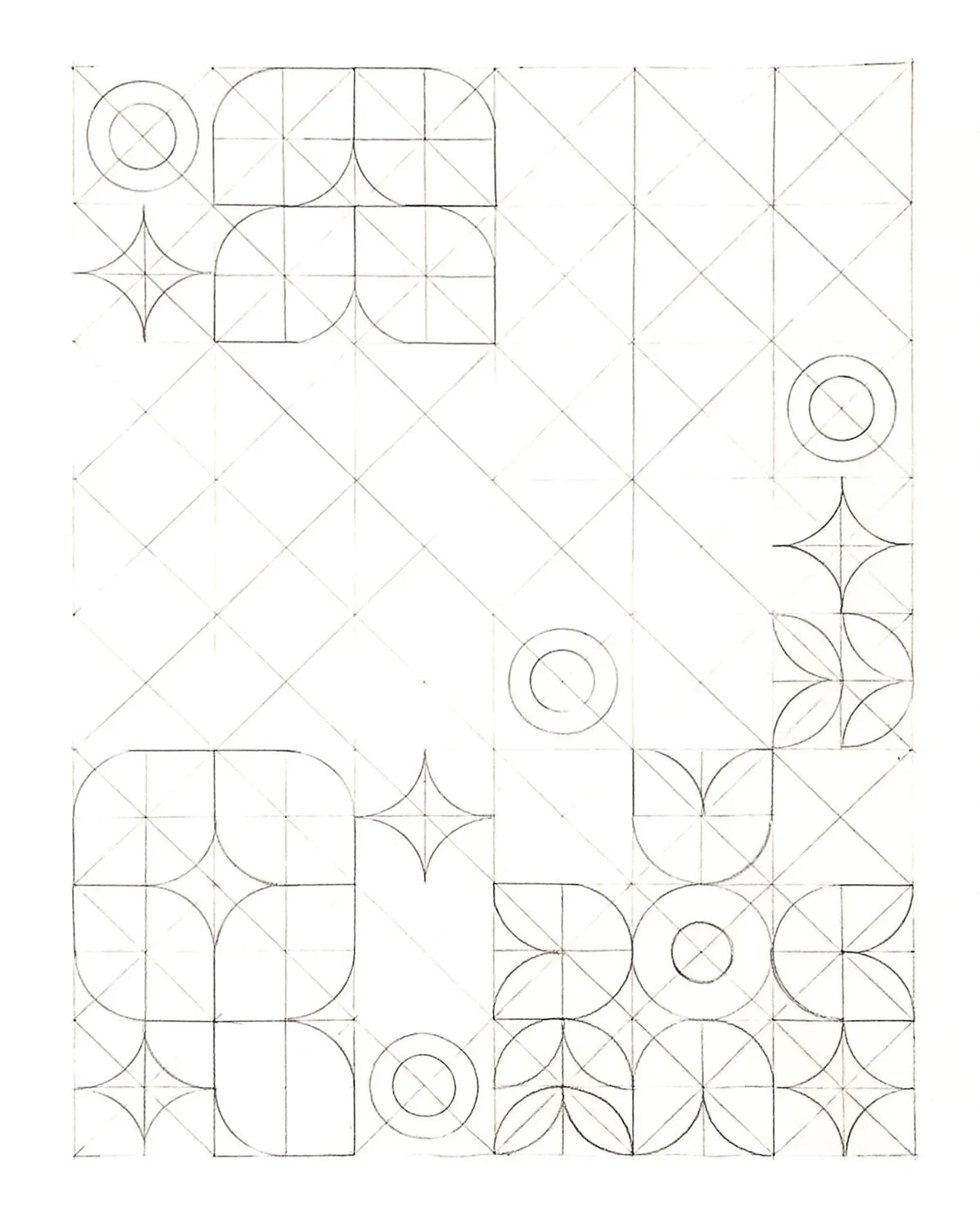
Work in progress
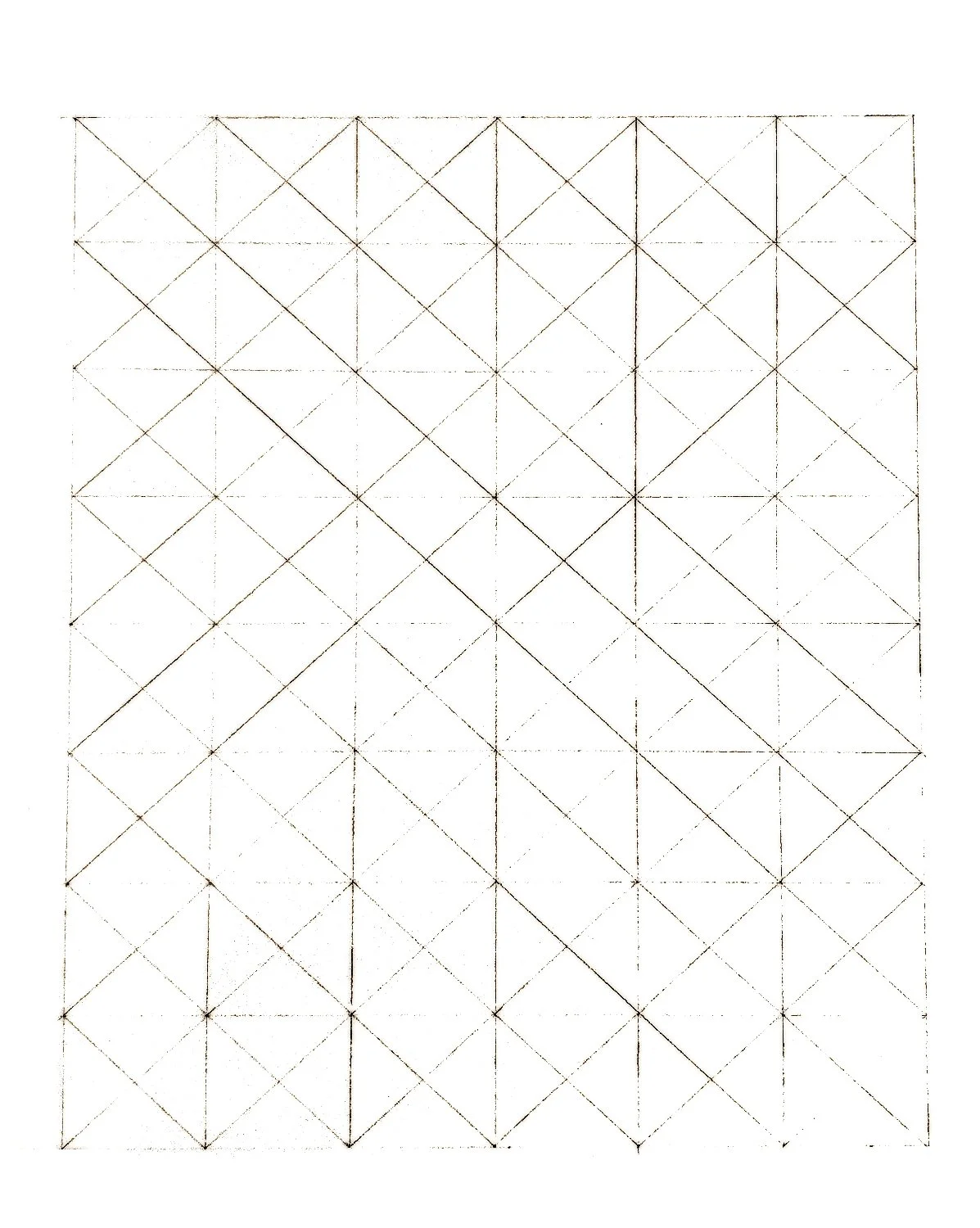
Initial grid
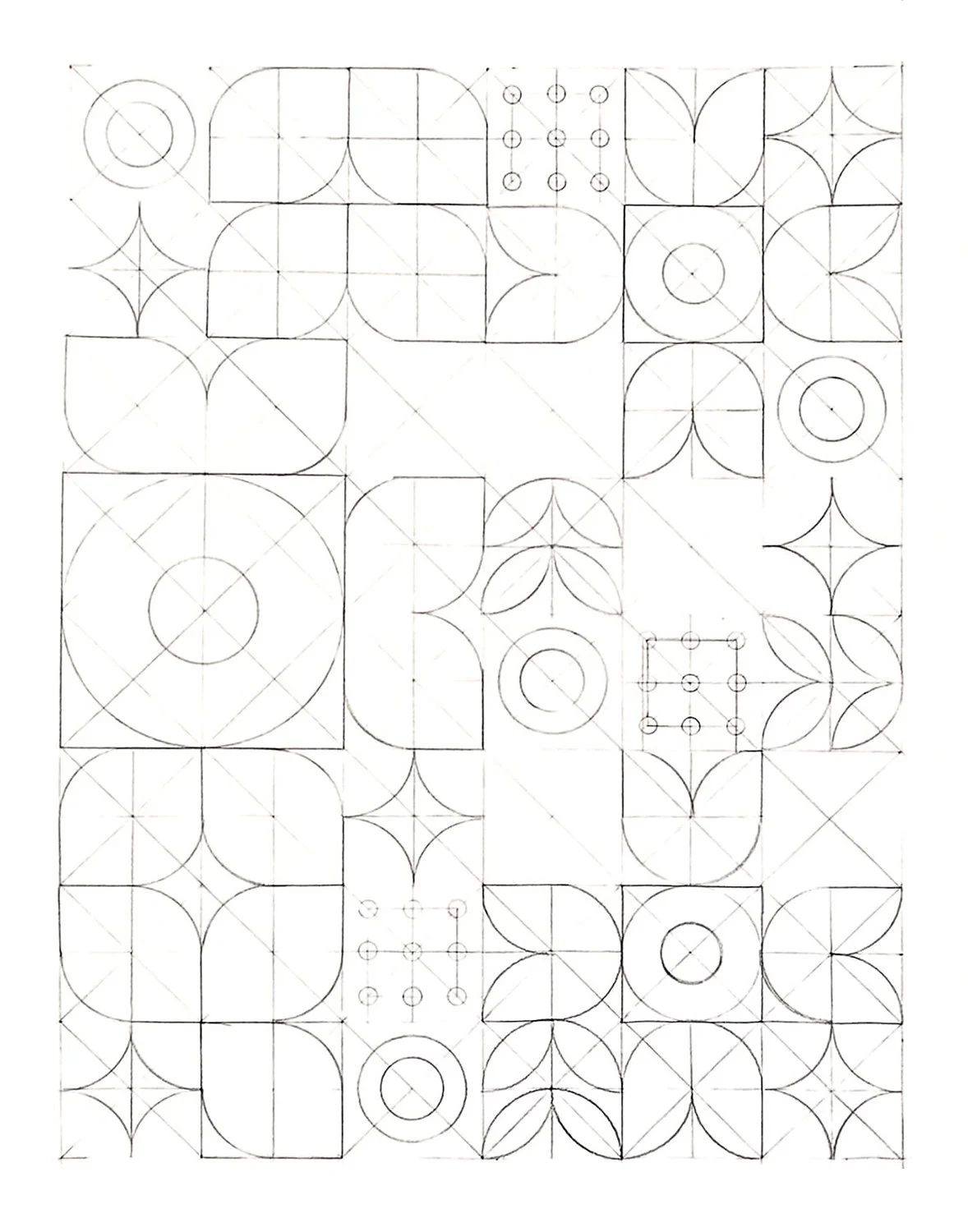
Final grid with all shapes
Painting Process
At the start every single stroke made me nervous and I was afraid of ruining my only paper sheet. By the fourth day I felt calmer, and painting had become a quiet break from the computer.
Before I started painting, I planned where to begin so I would not have to repeat any work. I laid down a thin background layer first, so the grid stayed visible, and then painted the shapes one color at a time. Only after that did I build the background up in many layers until it was fully opaque.
The first session was stressful: I had one sheet, an unsteady hand, and a streaky base coat. Over the four sessions I grew calmer, and at the end I cleaned up the edges with a white Posca marker. The yellow ochre background color needed the most layers and by mixing in a little titanium white finally made it cover.
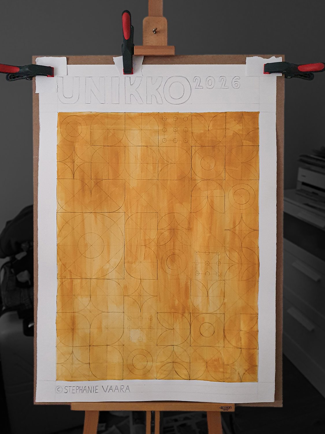
Thin base coat
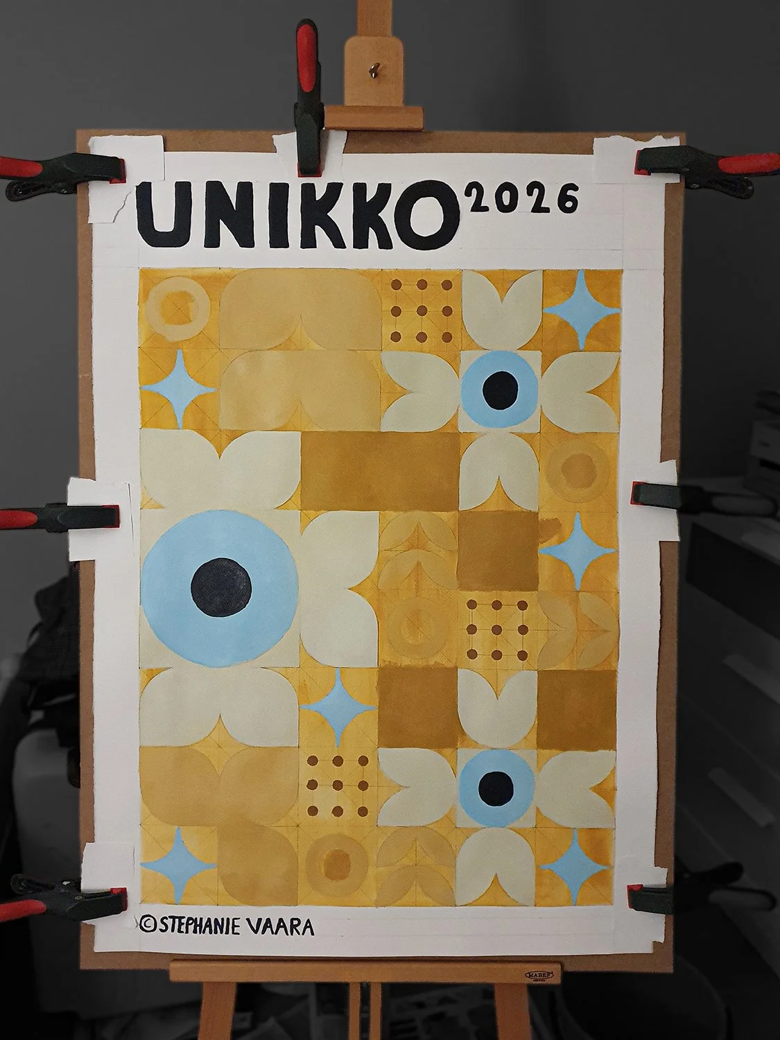
Painting in the shapes
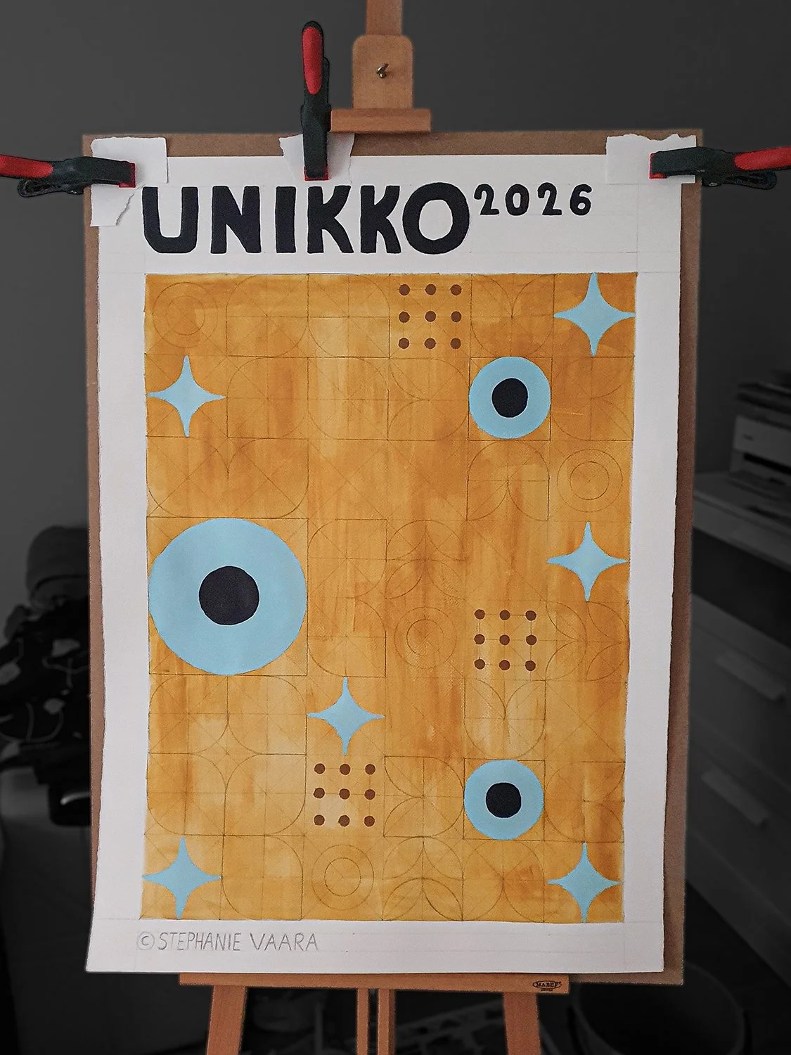
Painting in the shapes
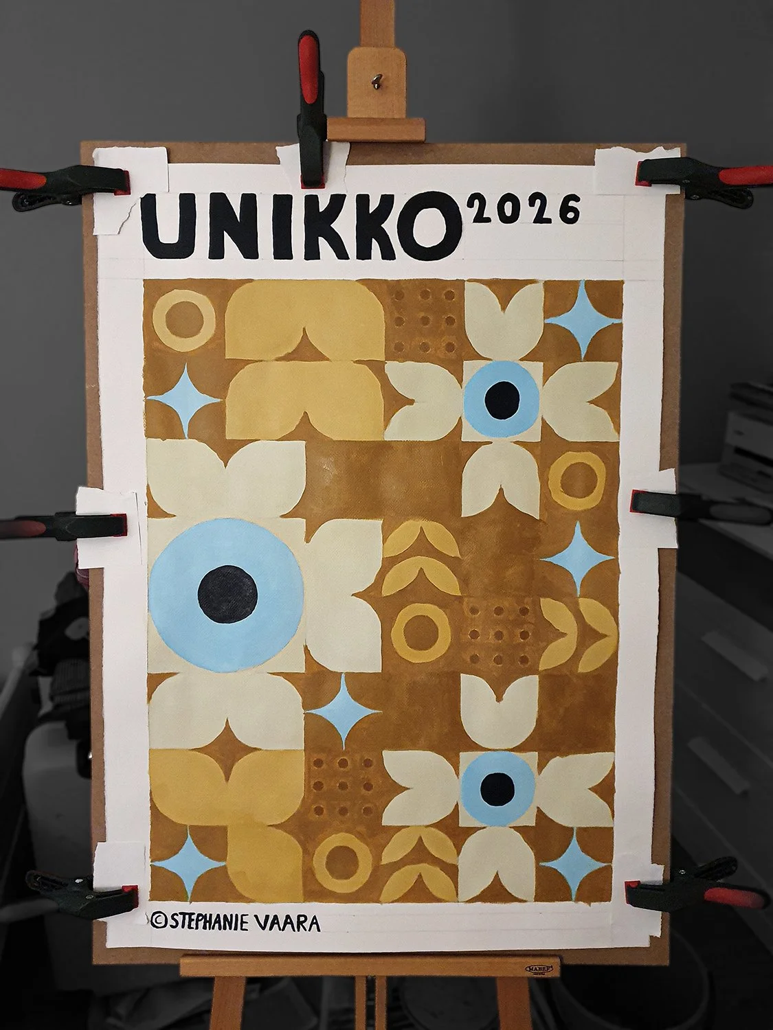
Filling in the background
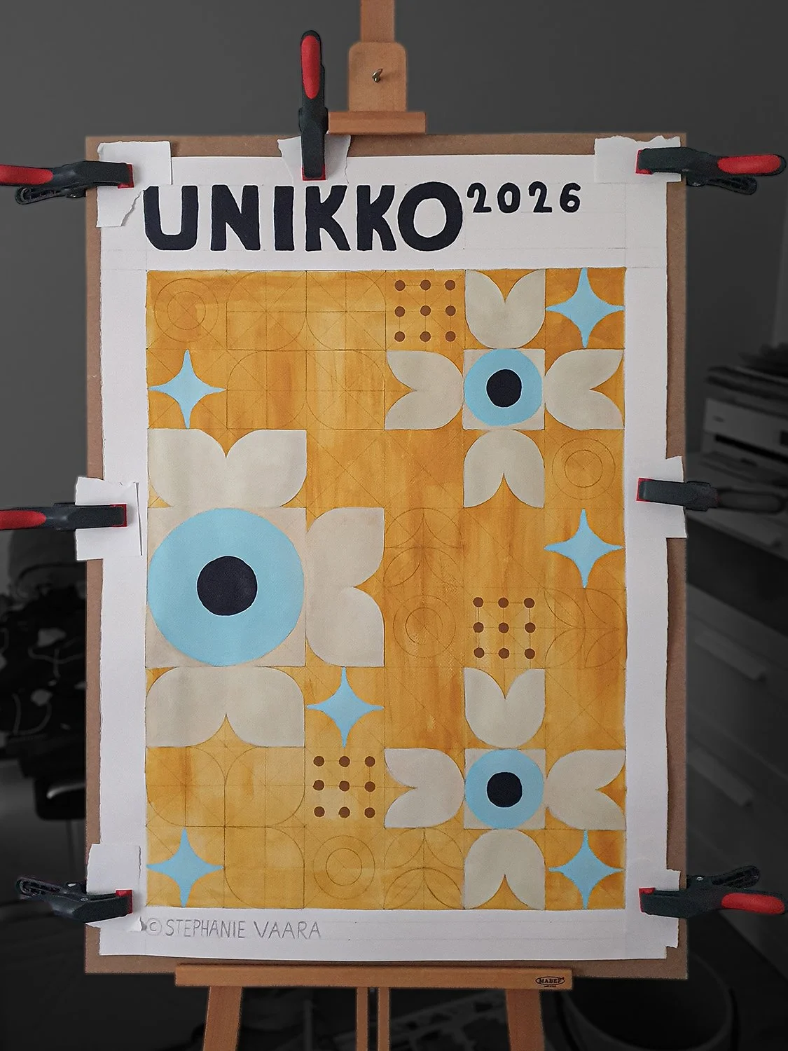
Painting in the shapes
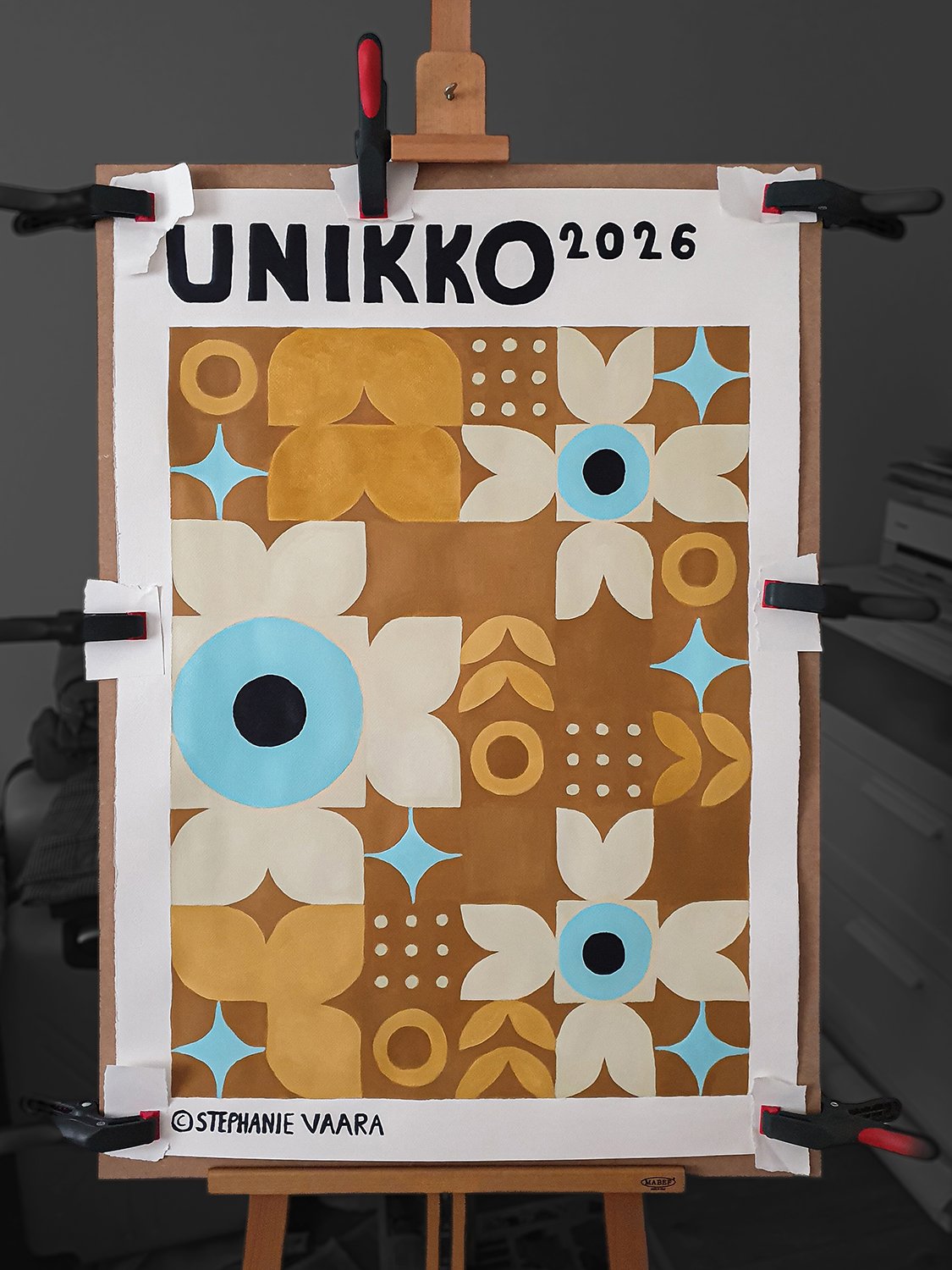
Final cleaned up piece
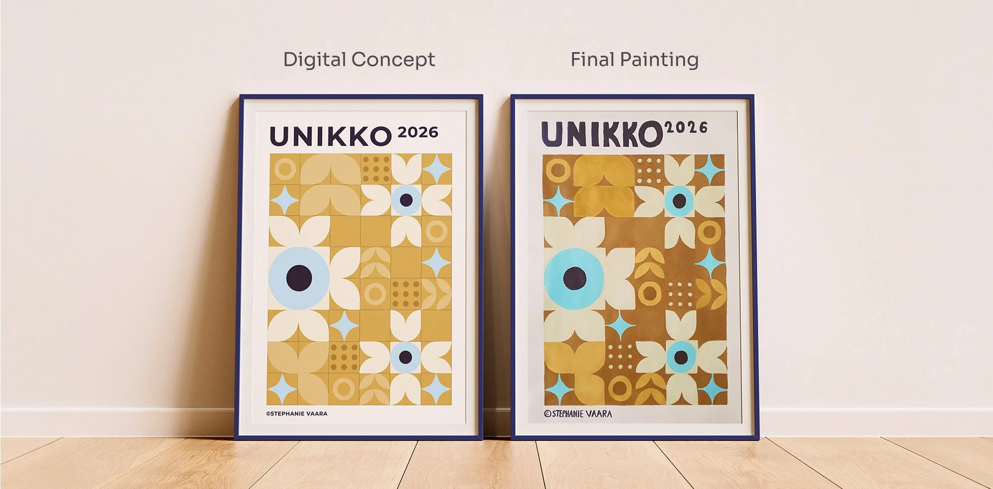
Success here was not a number, but whether people could recognize two design languages in one poster, and whether I could stand behind the finished work.
Project Impact
This was a study project, so I have no figures to share. Feedback in the review praised the poster’s look and structure, and the presentation focused on my design process.
They also found the Marimekko and Bauhaus pairing recognizable, with a strong color contrast and a handmade typography that suits it. I am proud that the concept came alive at this size, even with colors that differ slightly from my initial idea.
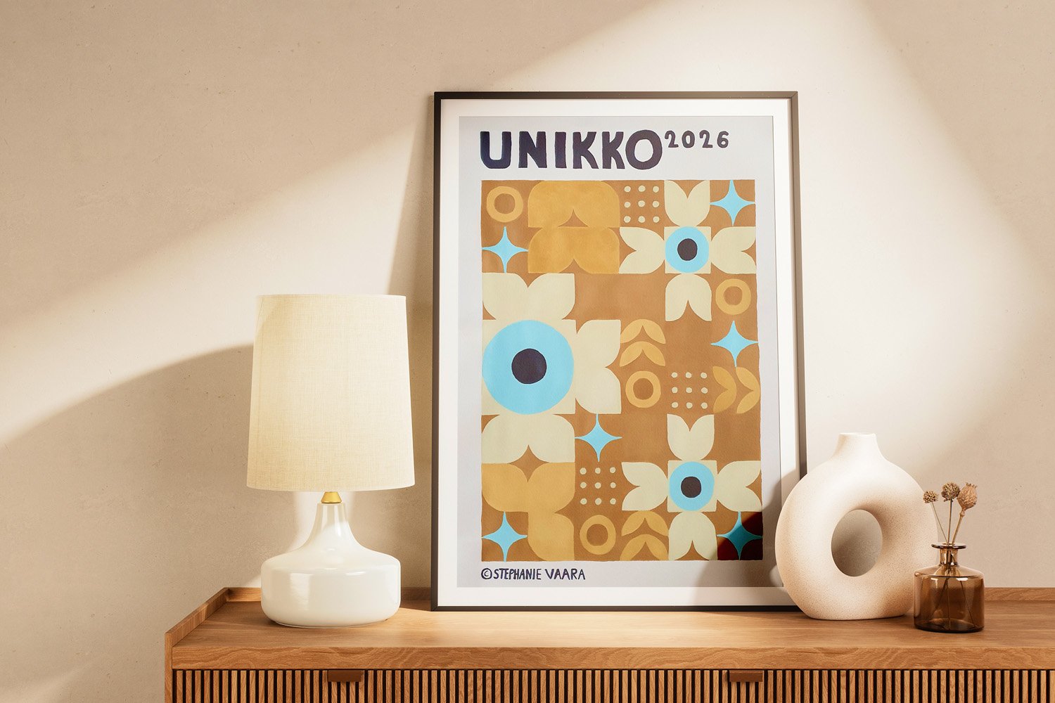
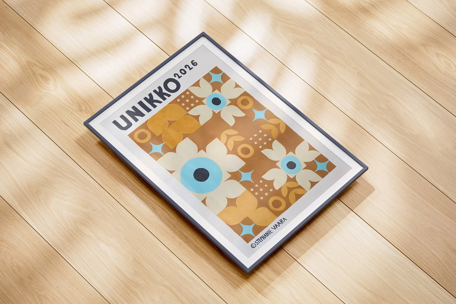
Why put a poster in my portfolio when the lettering and grid gave me so much trouble? Because the process, the decisions and the struggles are the story. Doing something by hand is the part I am proudest of.
What Stayed With Me
I planned the grid carefully but winged the typography and painting the lettering was agony. This piece is about showing my process, my decisions and my challenges - not only the final finished poster.
Some colors ended up different from my concept, yet the poster holds together because I stayed flexible and the chosen color palette works. Next time I will gather every material first and plan the lettering as carefully as the grid.
This also might be interesting
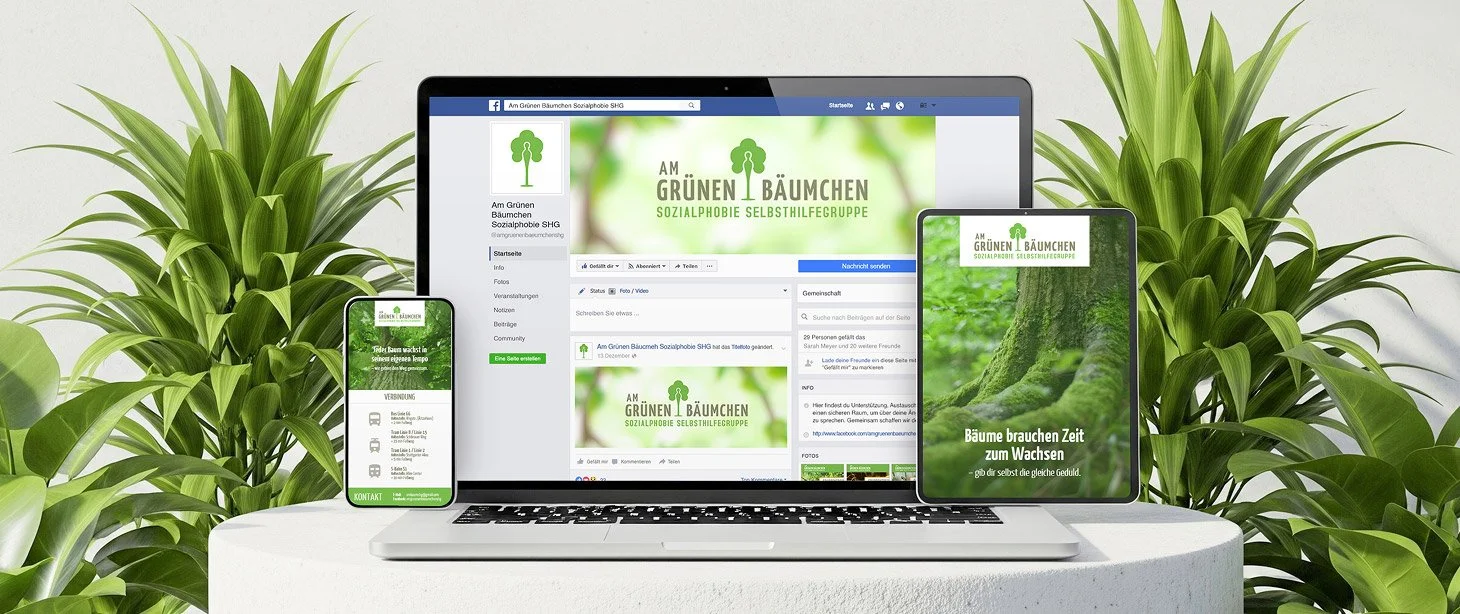
Am Grünen Bäumchen
Gentle identity for a mental health support group to built trust and understanding.
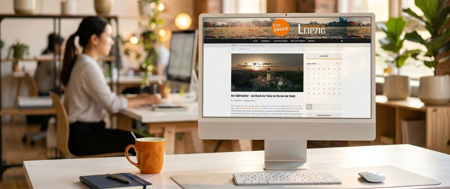
Eindruck
Eindruck highlights overlooked projects through curated editorials and thoughtful features.
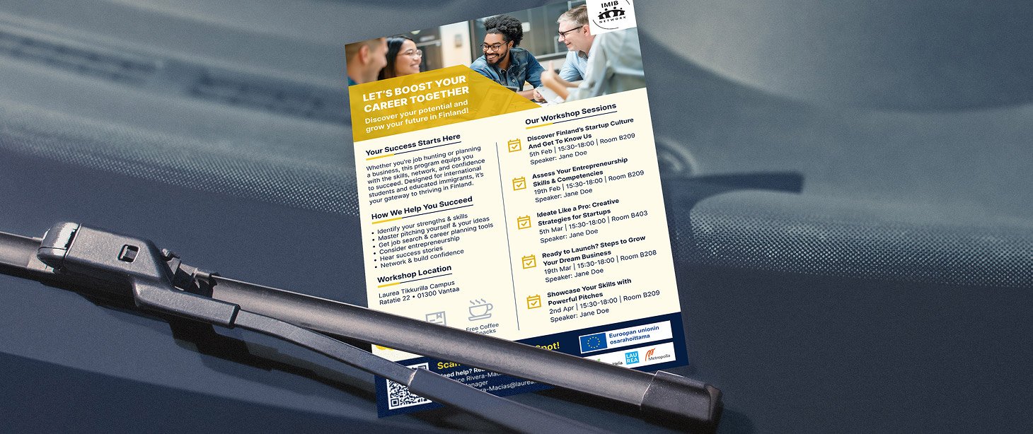
IMIB-Network
Service design to help international professionals find startup support in Finland.