Where Overlooked Becomes Visible
Industry: Nonprofit Media Publishing
Role: Media Assistant
Timeline:
2015 - 2016 (print & identity phase)
2018 - 2020 (digital blog phase)
Deliverables:
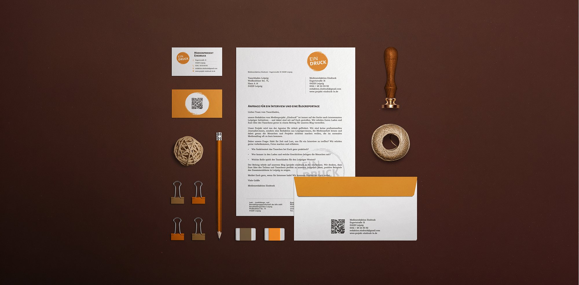
• Brand Identity
• Print Editorial Design
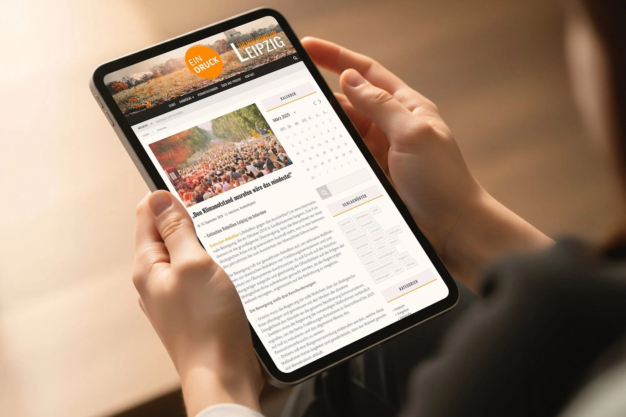
• WordPress Management
• Workshops & Training Materials
• Guides & Tutorials for future participants
• Journalistic Content
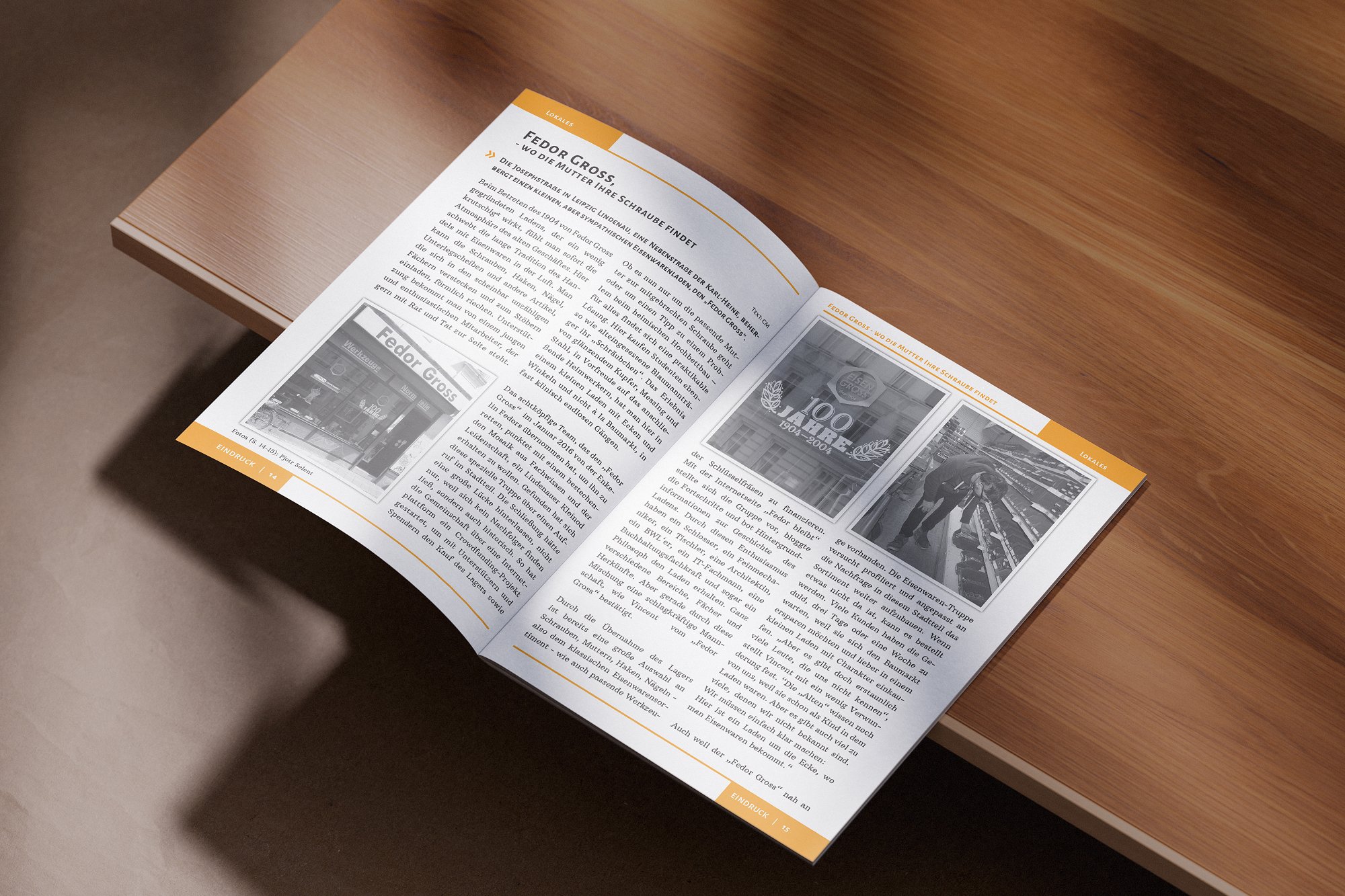
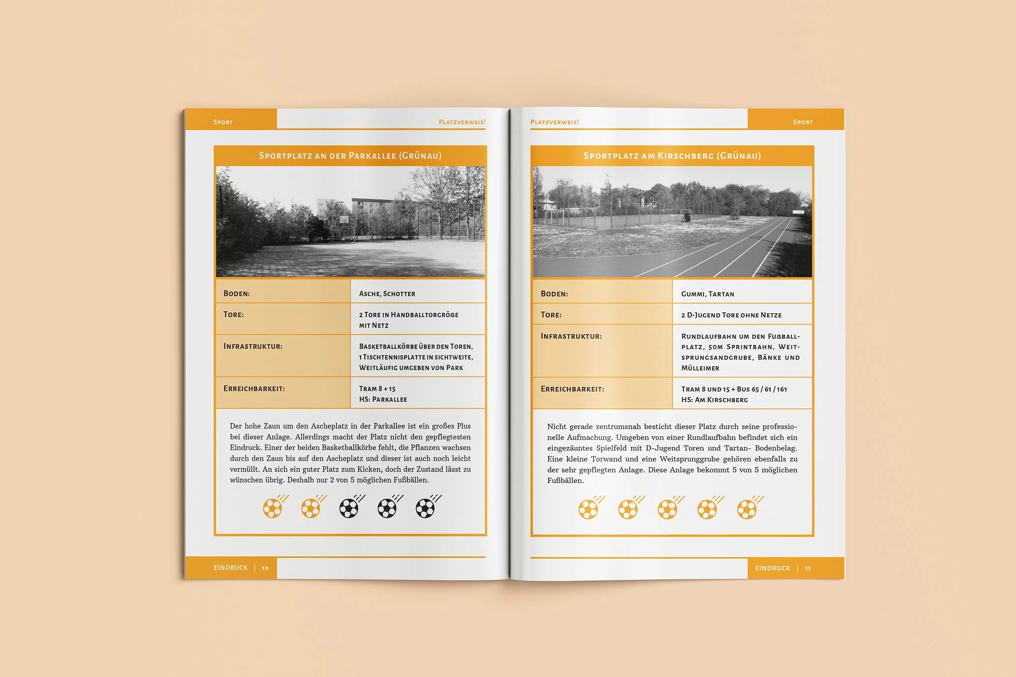
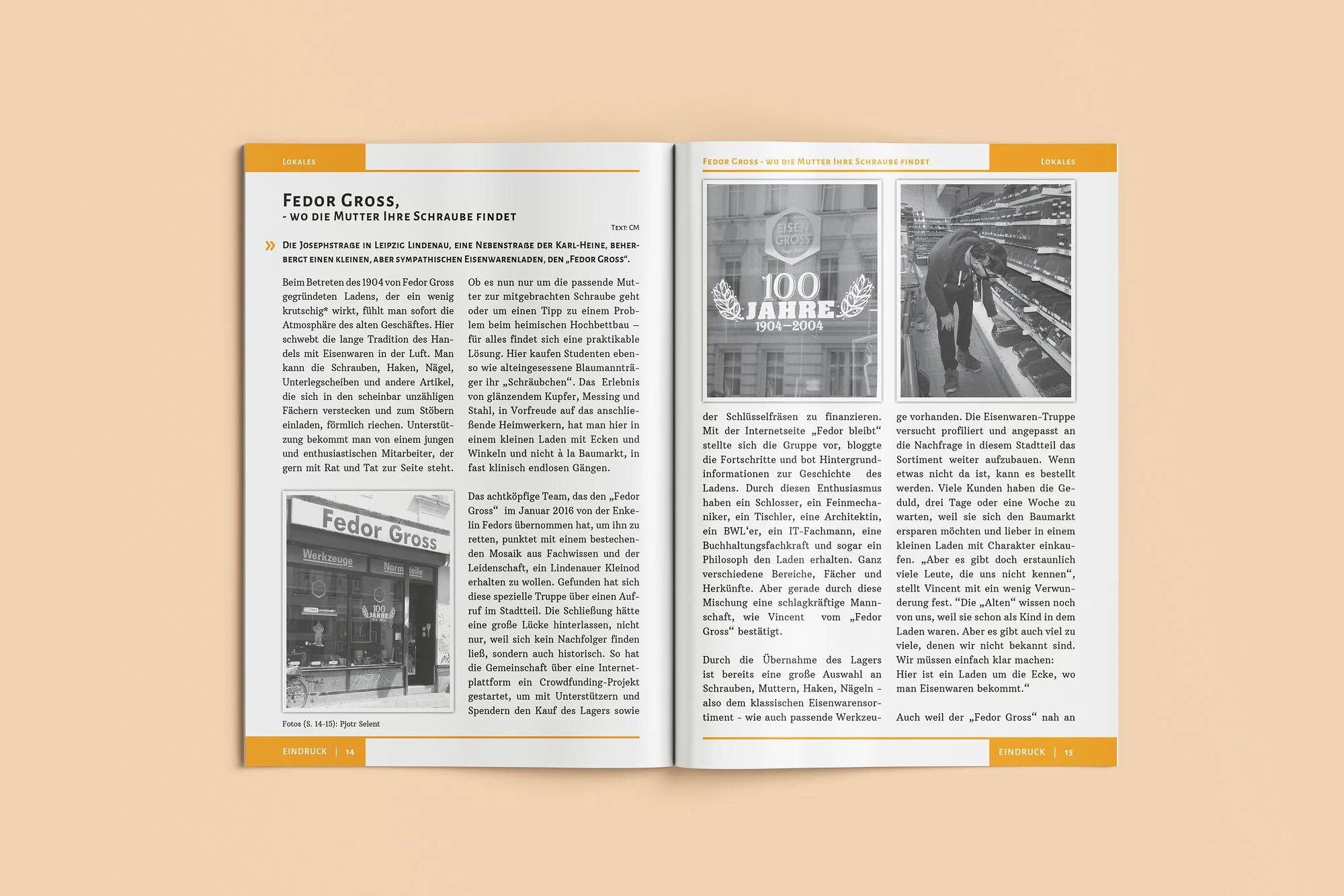
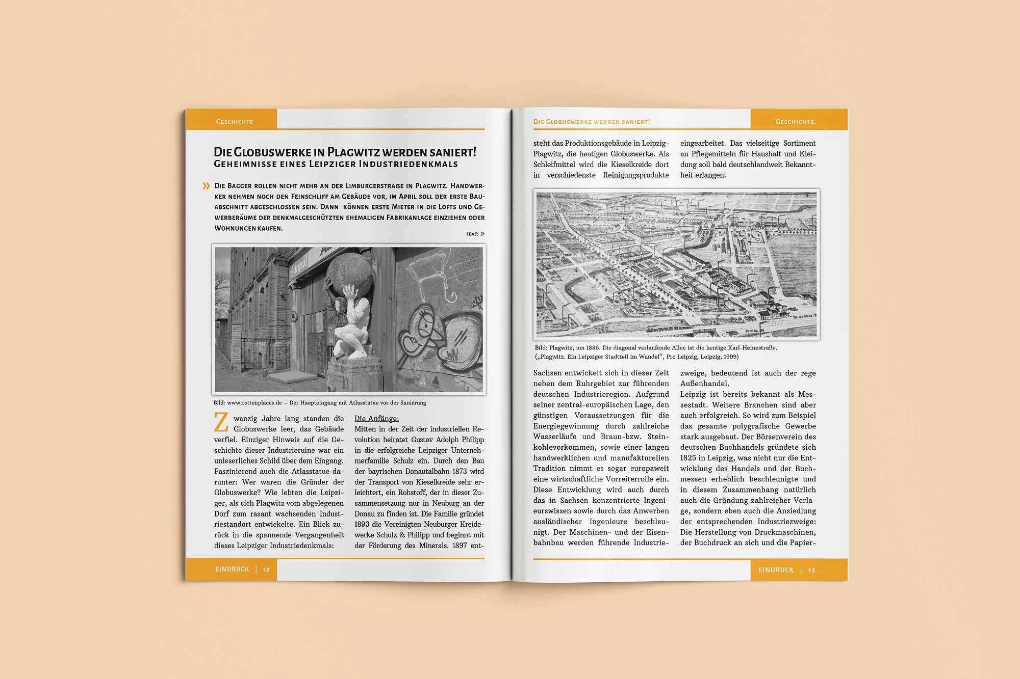
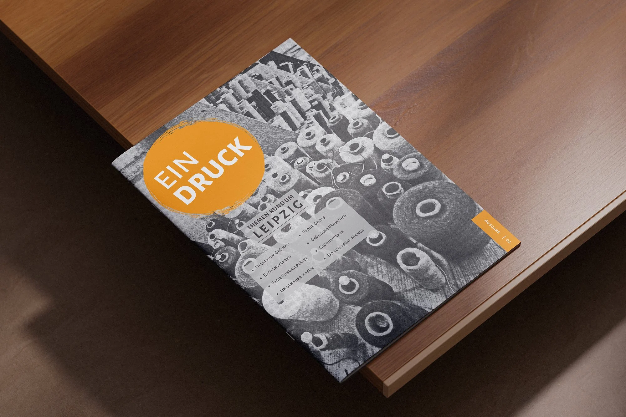
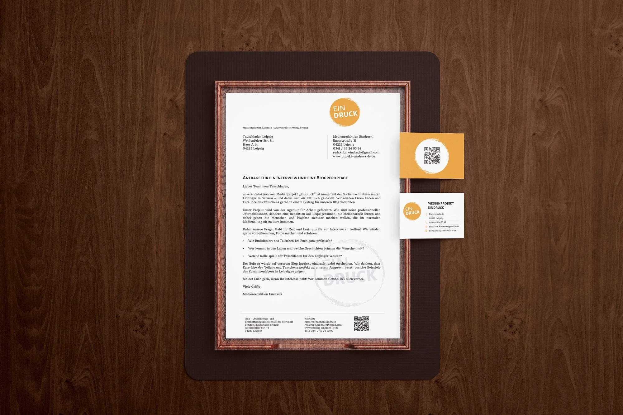
Eindruck is a Leipzig-based editorial project that has been running since 2017, built on the belief that every story deserves to be told. Participants form their own editorial team, independently choosing topics and producing interviews, reports, and short films about social initiatives and people often left out of the mainstream conversation.
Ad-free and free of charge, the project prioritizes community over commerce. It grew from a 2016 print newspaper and carries that same spirit forward: giving real voices a platform, and making media something anyone can be part of.
This project began with clear boundaries and a lot of curiosity. Every choice had to count, from color to layout to tone. What started as a design challenge soon became an exercise in trust, collaboration, and finding creativity inside the lines rather than outside them.
Designing Inside the Lines
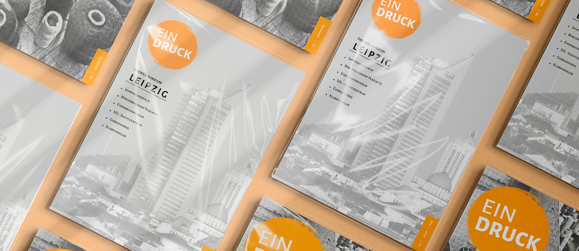
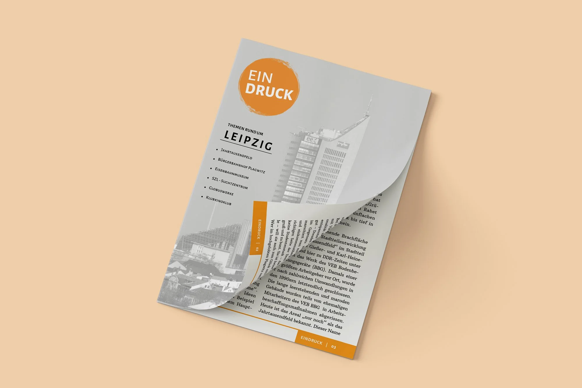
From the beginning, this project asked for balance between design choices and human connection. The newspaper had strict boundaries: black and white with one accent color and a set number of pages. Those limits became part of its personality. But the deeper work was about people, building confidence, sharing knowledge, and helping skills take root.
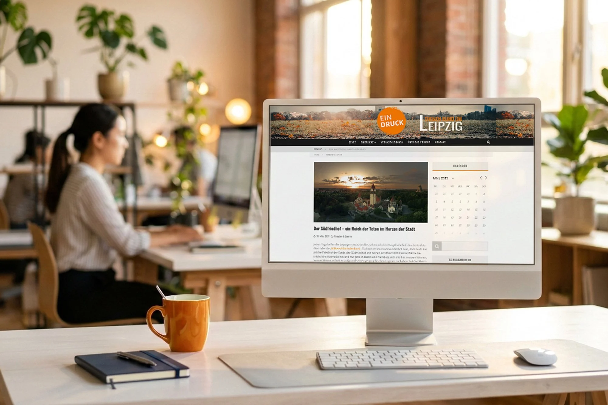
My role grew with those needs, shaping Eindruck’s identity, designing layouts, maintaining the online presence, and helping others feel at home in the creative process.
Real understanding begins by listening. This project grew through observation, conversation, and shared experience. Every design and editorial decision took shape around the people it aimed to serve, balancing their needs with the voices of those who would one day read their work.
Defining the Audience
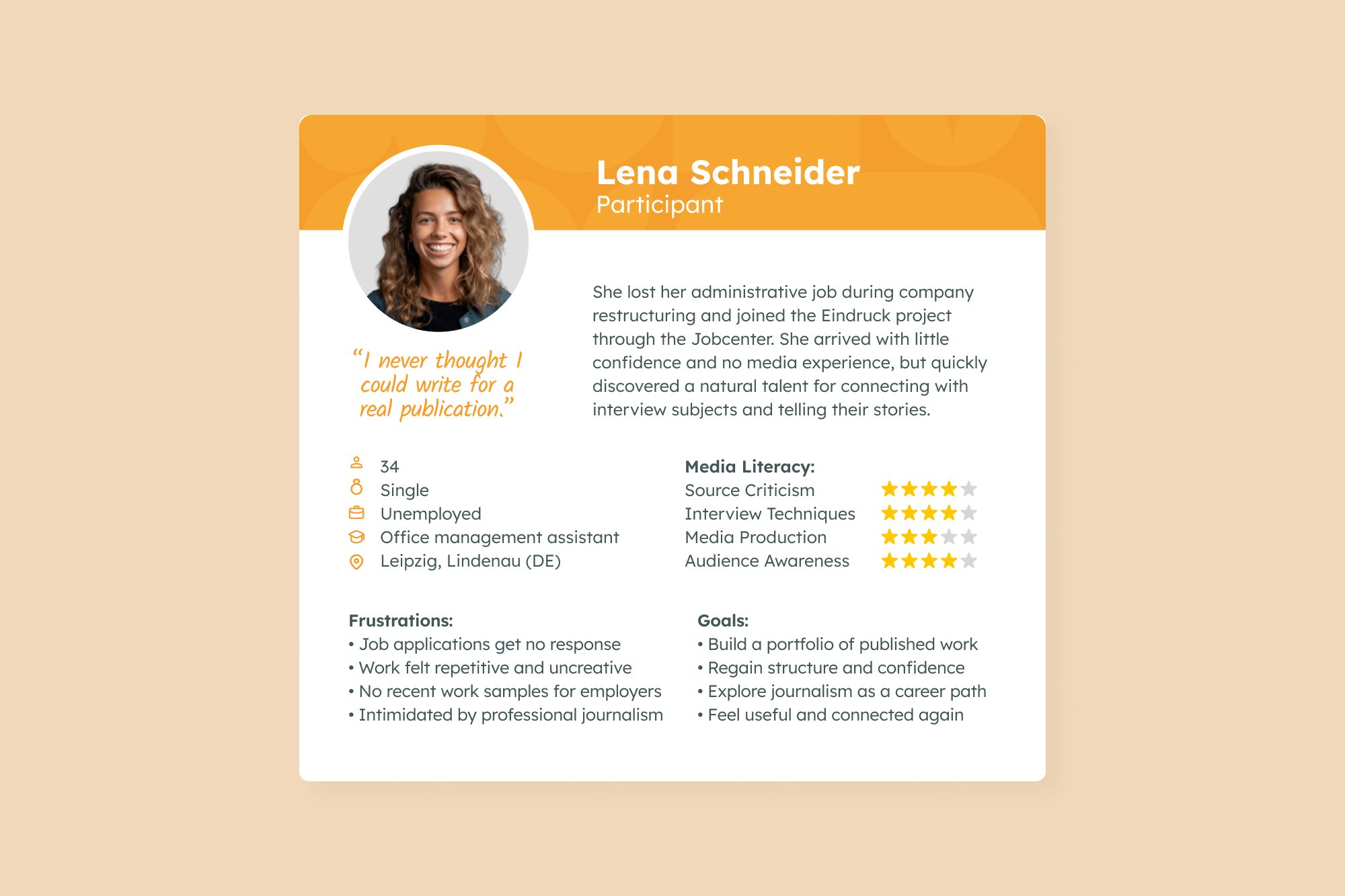
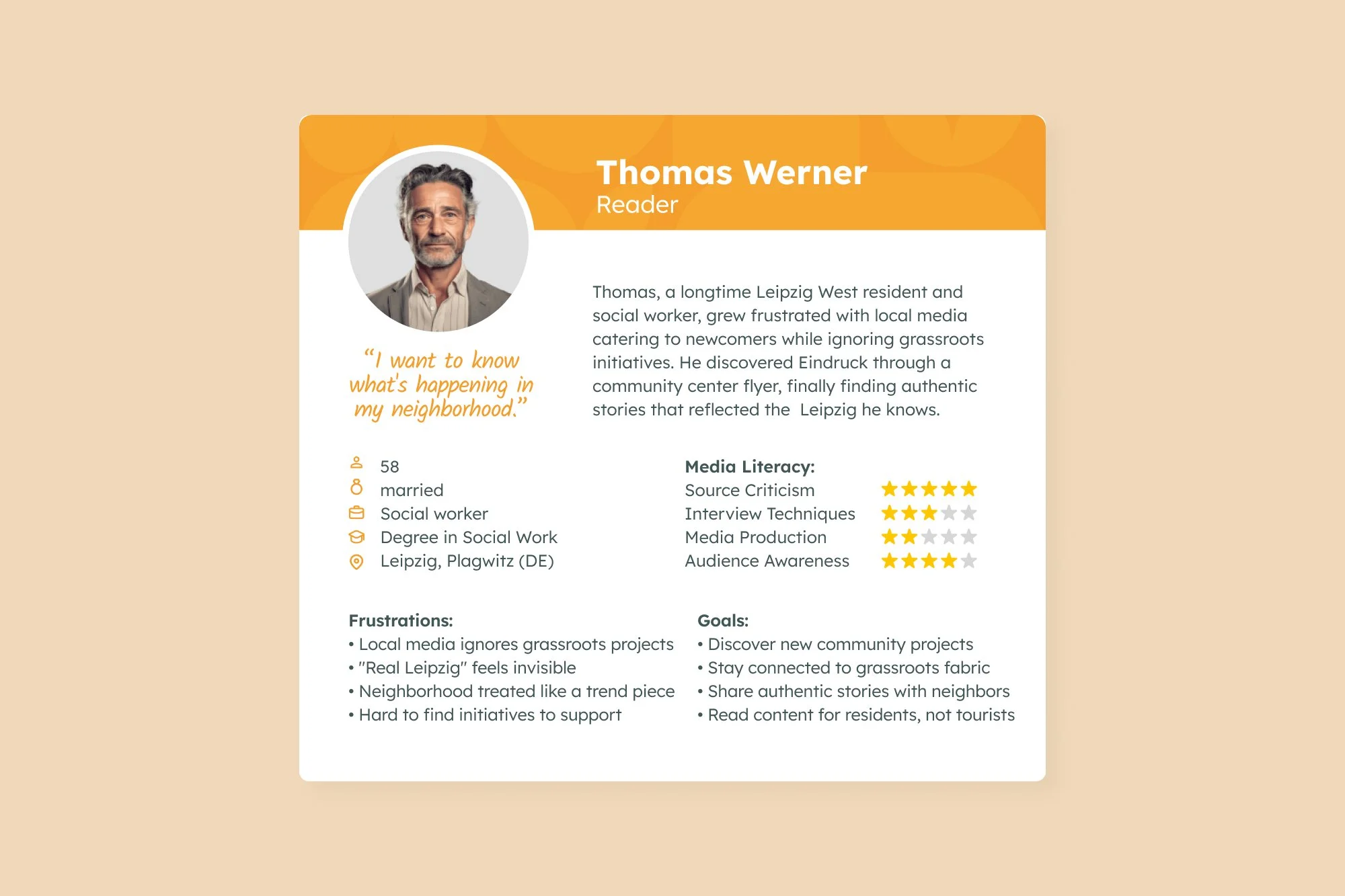
Understanding who this project was truly for shaped every choice. The research was informal but deeply attentive. Working closely with participants and the coordination team revealed two audiences that needed equal care.
The first was the participants themselves, seeking confidence and a sense of voice. The second was the Leipzig public, drawn to local stories with honesty and warmth. By combining professional standards with genuine curiosity, Eindruck found a middle ground that felt both credible and human.
The heart of this design strategy was quiet but focused: to make something small feel intentional. Every detail, from color to type, carried meaning. The goal was never to outgrow the project’s scale but to show how restraint could still hold depth and confidence.
Design Highlights
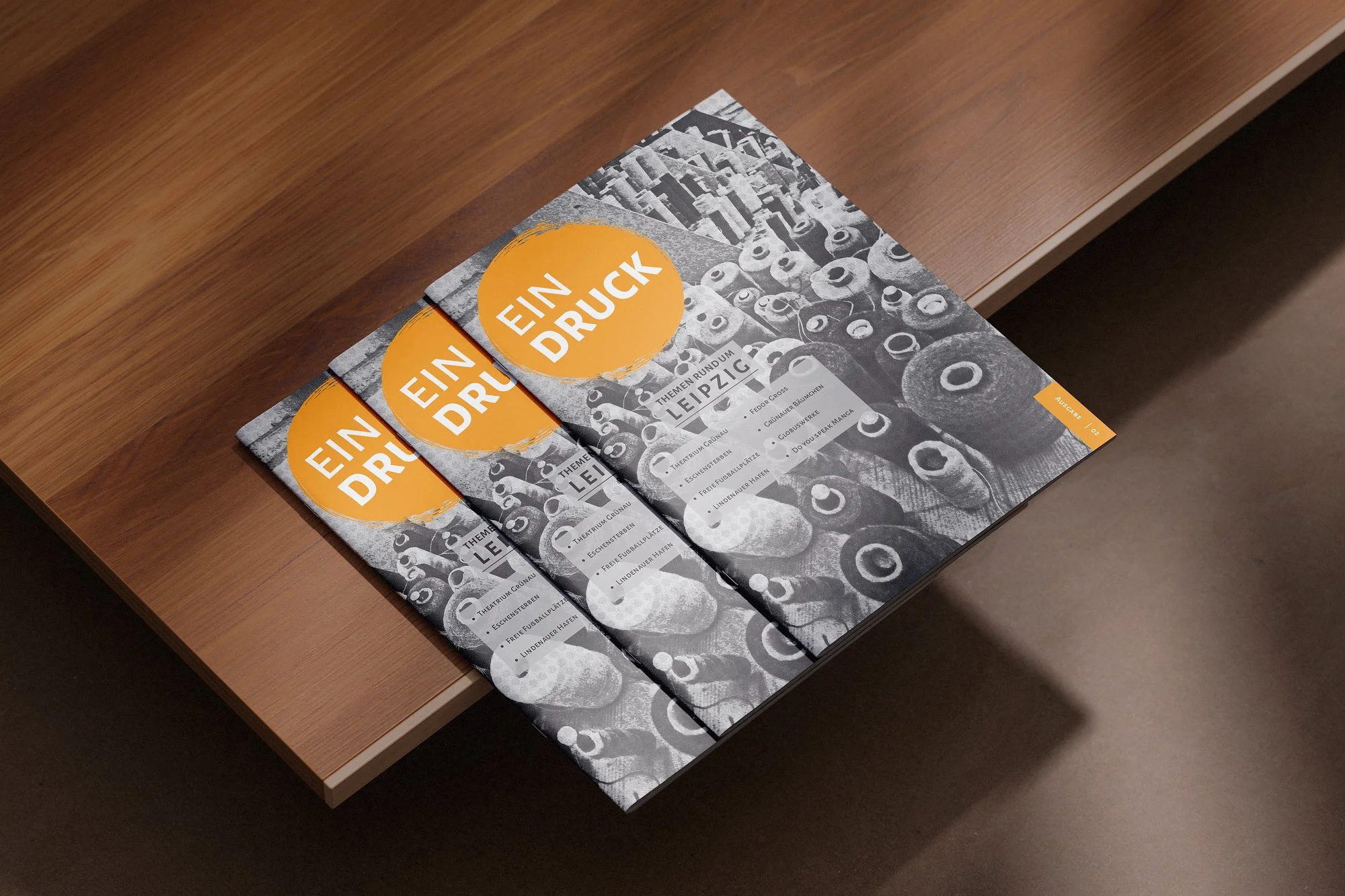
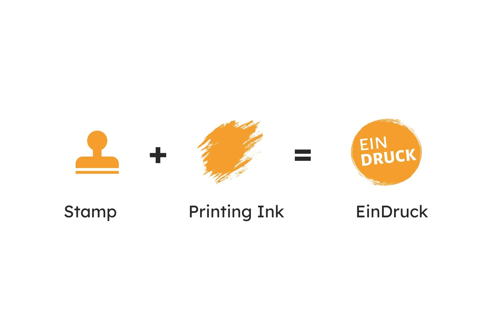
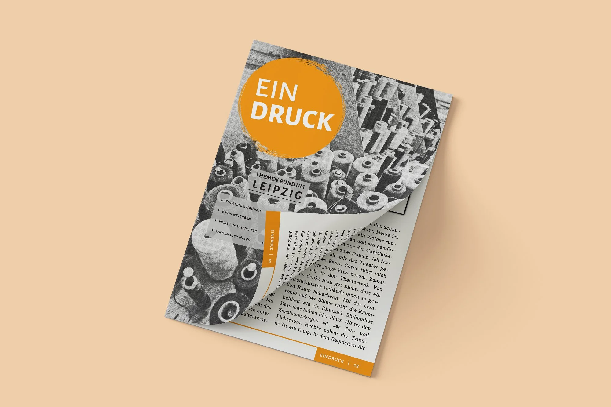
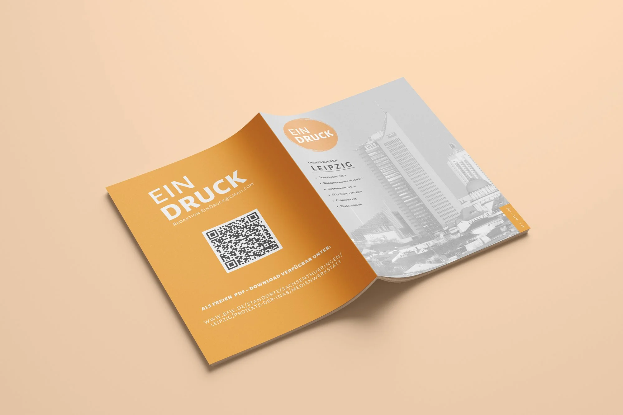
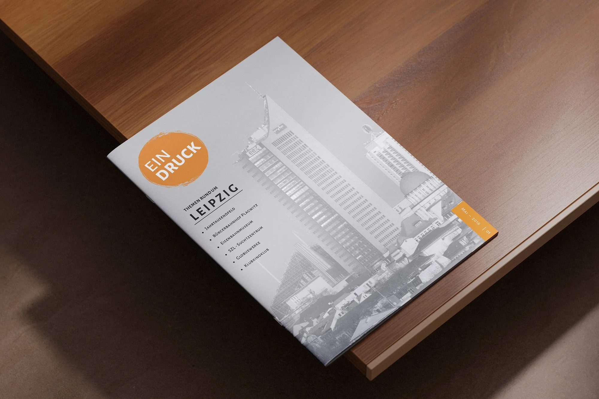
The design strategy aimed to make something small feel intentional. Within tight limits, the goal was to build a visual identity that felt deliberate rather than restricted. The logo began with a word: Eindruck, meaning both an impression and the act of printing. The symbol took form as a simple, stamp-like mark.
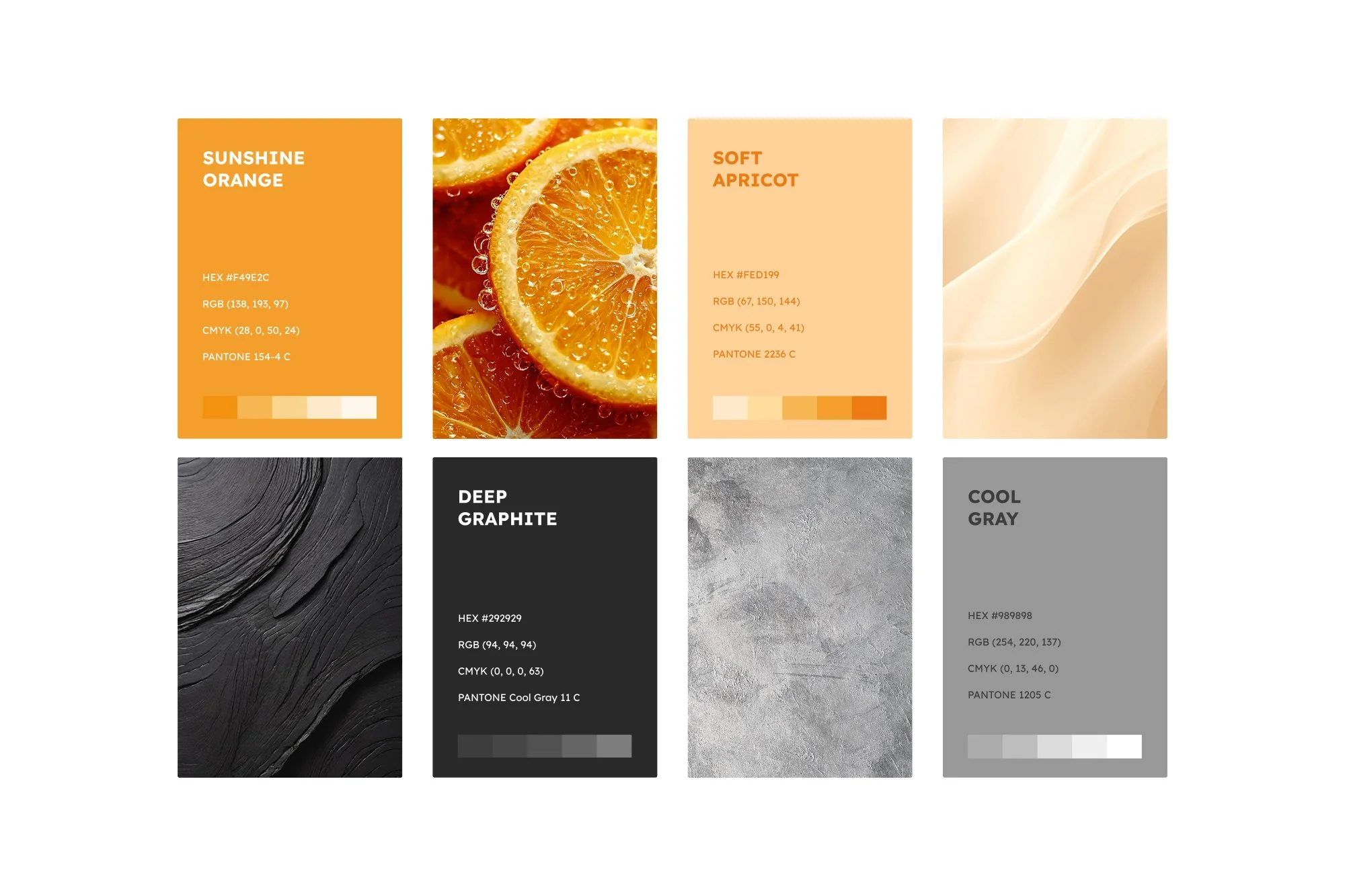
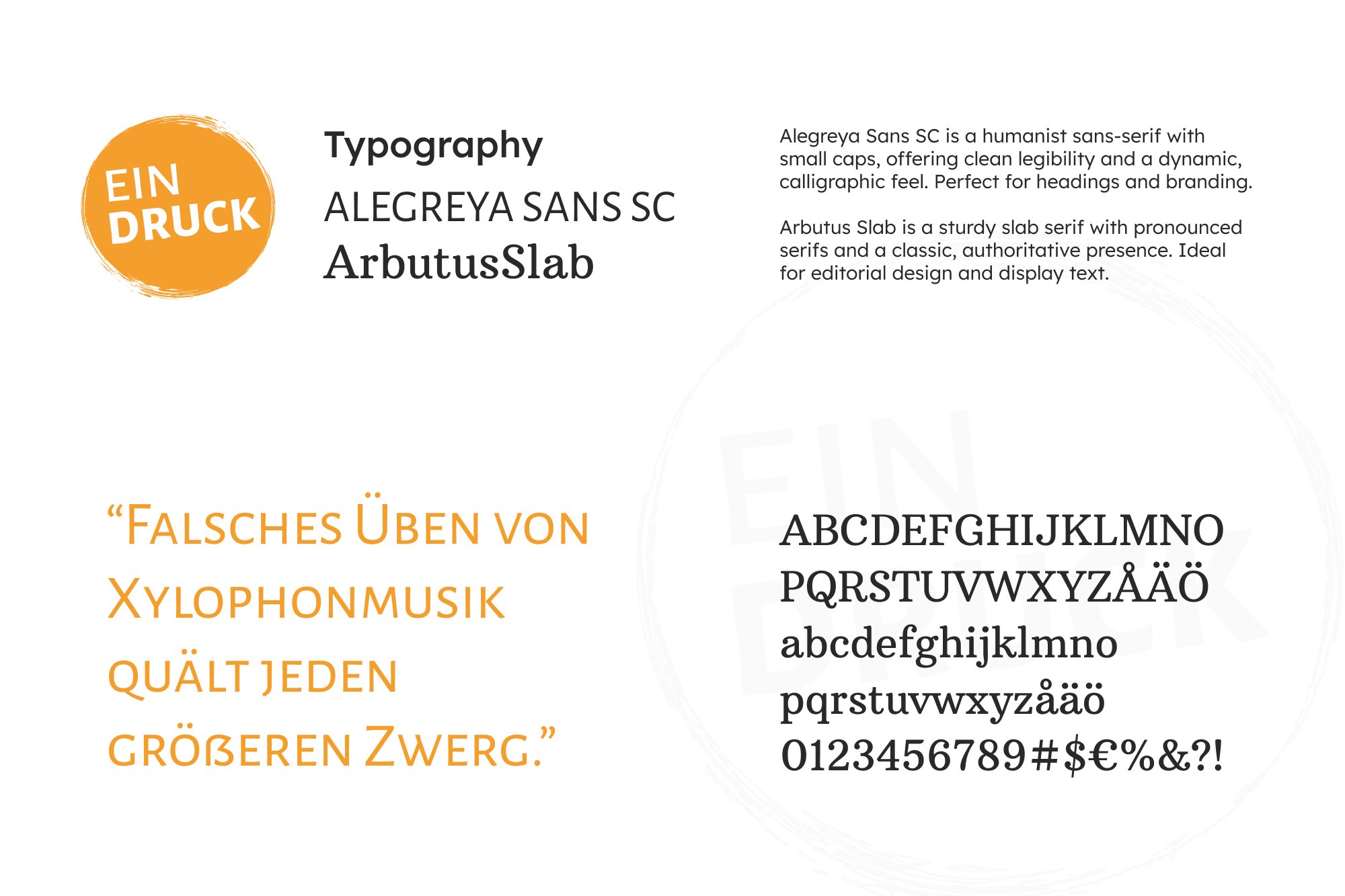
Its colors and typefaces balanced warmth with precision, combining citrus orange with deep graphite and humanist fonts. Together, these elements created a voice that felt grounded, local, and quietly confident across every format.
What began as a design project turned into a shared commitment. People wanted to take part, not just to create, but to belong to something that treated their work with care. The growing participation proved that design can nurture community as much as its appearance.
Project Impact
Participation grew steadily, showing that what the project offered was truly needed. People wanted to be part of something that respected their curiosity and gave it form. Feedback from organisers and partners was overwhelmingly positive, praising both the design and the atmosphere it created.
For participants, the impact ran much deeper than a finished publication. They gained skills, confidence, and a sense that their experience had value. For me, it reaffirmed that design at its best helps people see that what they are doing matters.

The most lasting impressions came from the people around the work, not the work itself. Every small discovery, each shared skill, felt like proof that design can make space for confidence, trust, and change that begins long before the final outcome.
What Stayed With Me
What stayed with me most were the moments in between: a participant discovering an eye for photography, a workshop when something suddenly made sense, a story taking shape through conversation. Sharing what I knew and seeing it become useful was deeply rewarding.
I learned too, especially about what collaboration really means. The relationships built made the work feel rooted in something real. If I could change one thing, I would have documented more to capture how the project grew. It proved to me that design, when it serves people, can quietly change what feels possible.
This also might be interesting
Am Grünen Bäumchen
Gentle identity for a mental health support group to built trust and understanding.
Schattensprünge
Schattensprünge is a non-profit support group for young adults experiencing social anxiety.
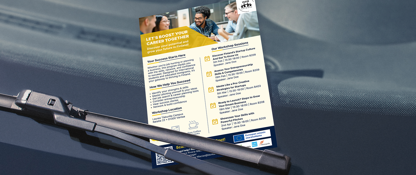
IMIB-Network
Service design to help international professionals find startup support in Finland.
